Liv Dining Club
Tools used
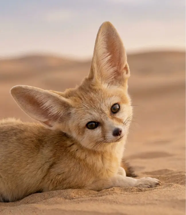
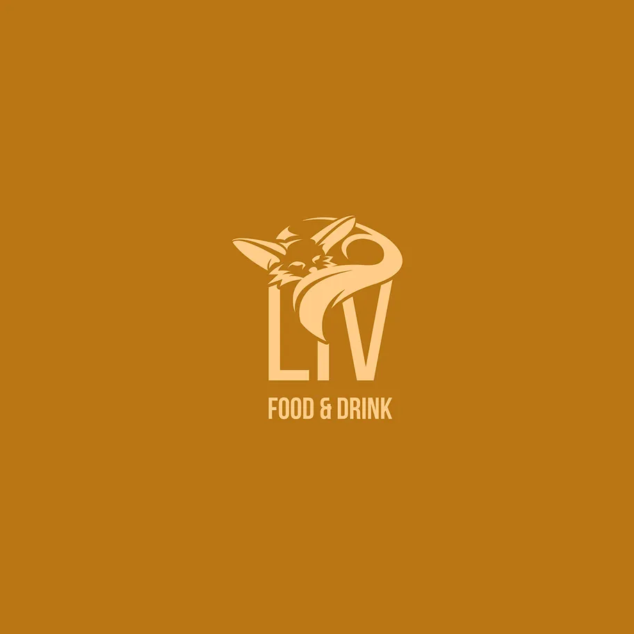
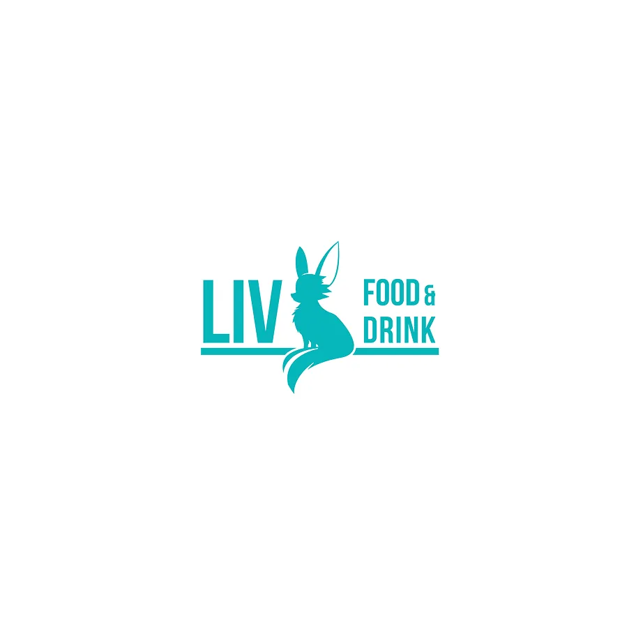
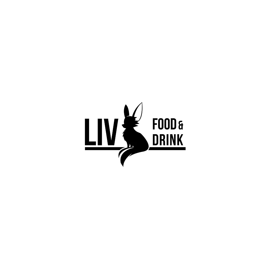
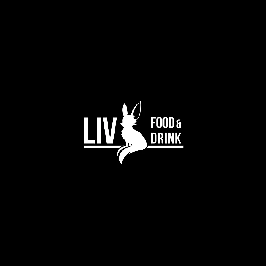
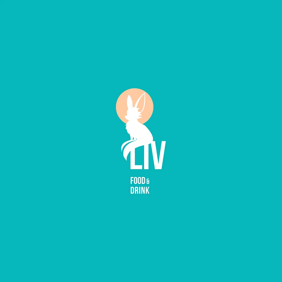
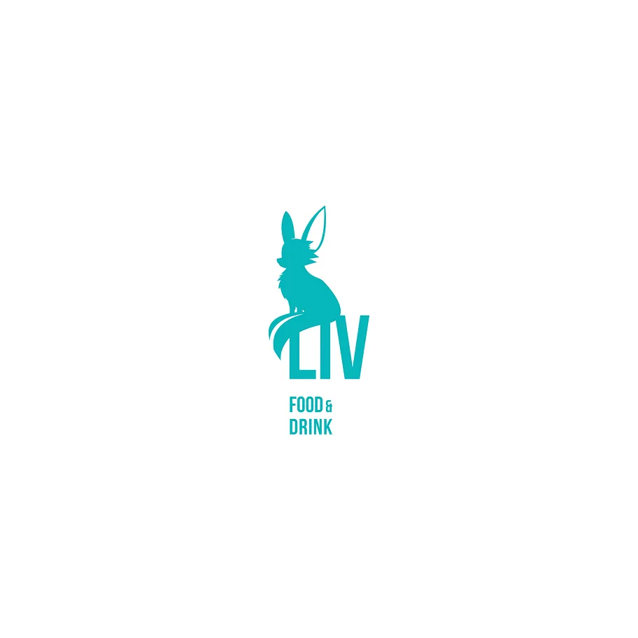
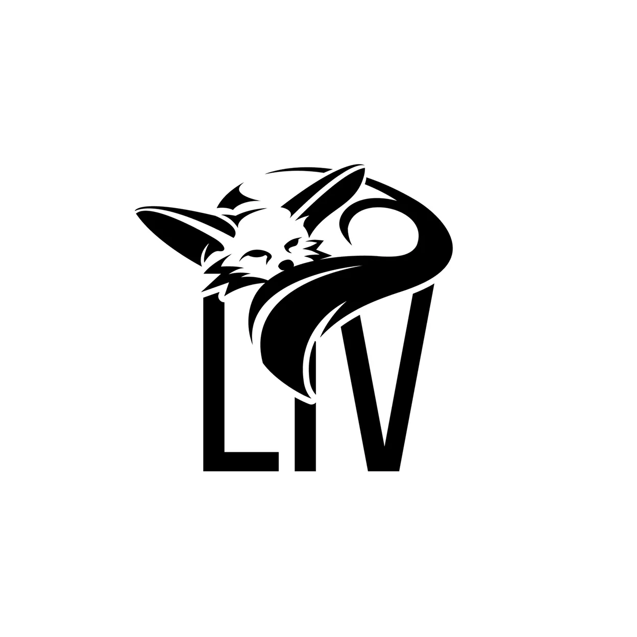
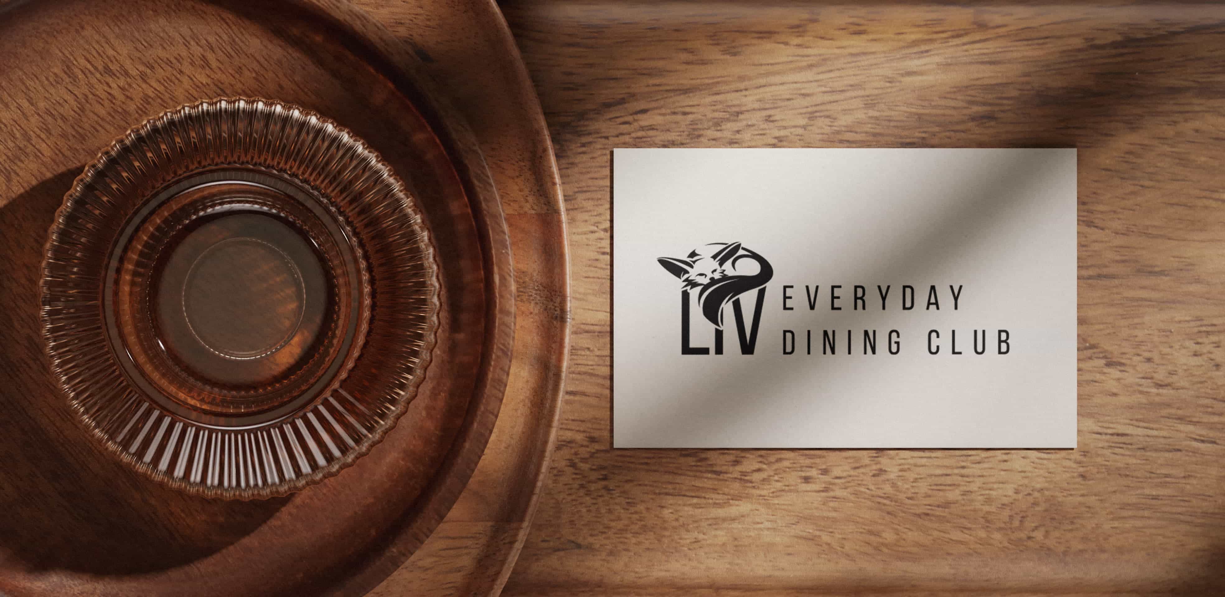
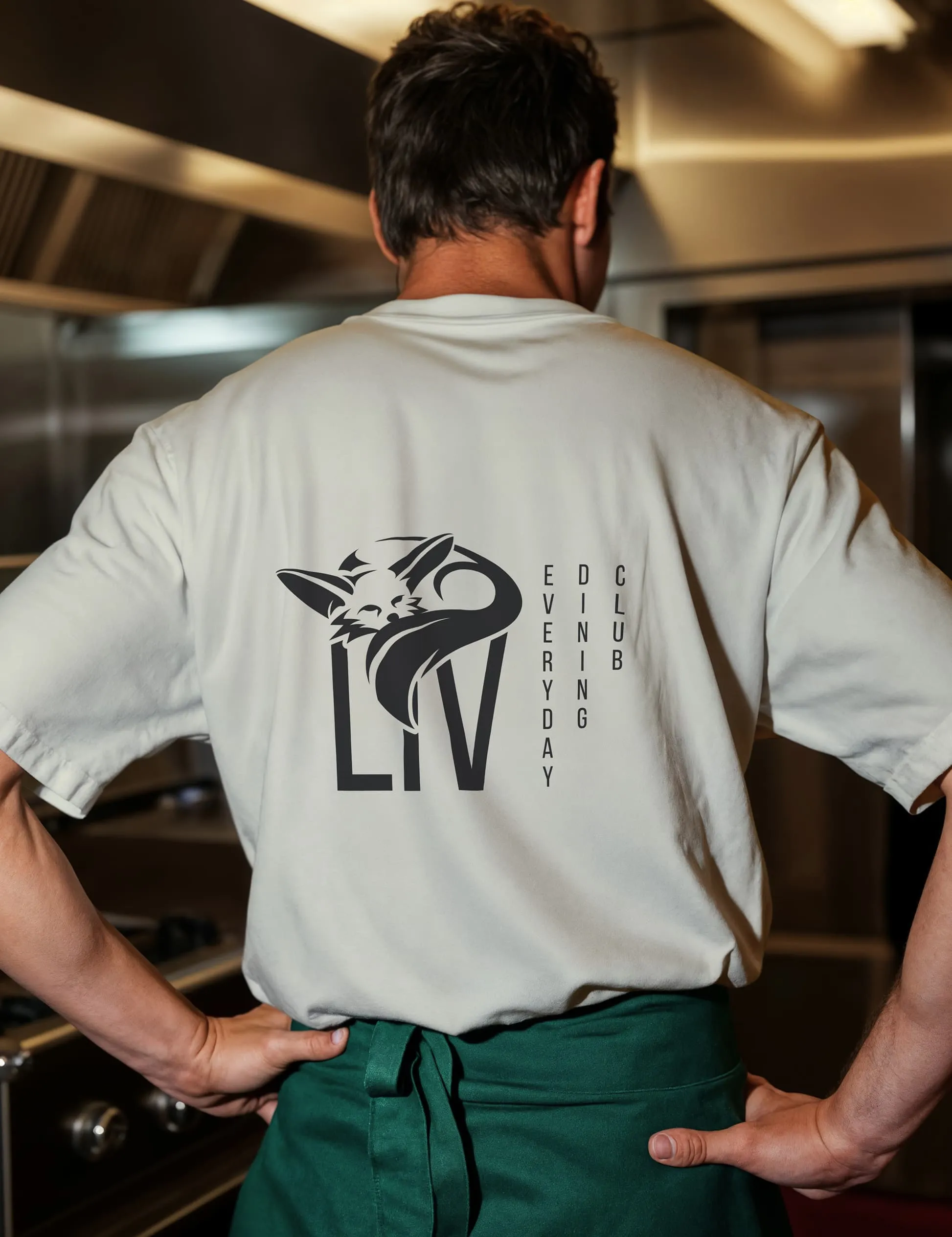
As part of the project, the main logo and a consistent logo family were developed and defined, including clear protection zones and binding application guidelines. A stylized desert fox serves as the defining visual element. Its origins in the Arab world refer to the Syrian roots of the brand, while the design with Asian-inspired eyes gives the symbol a friendly, cheeky, and contemporary character, conveying a sense of closeness and familiarity.
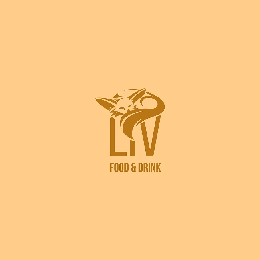
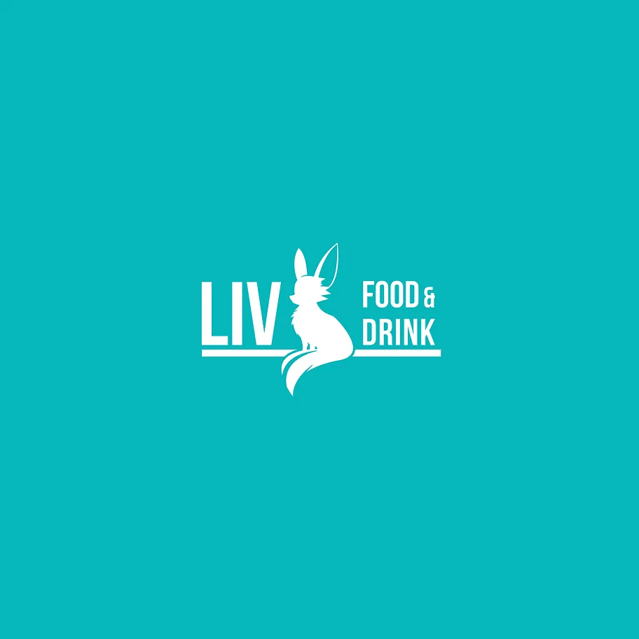
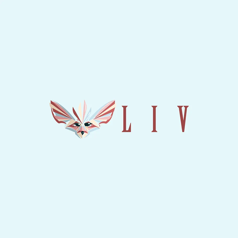
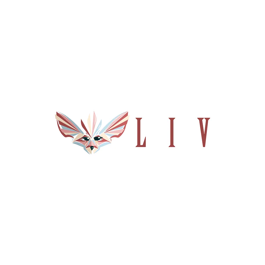
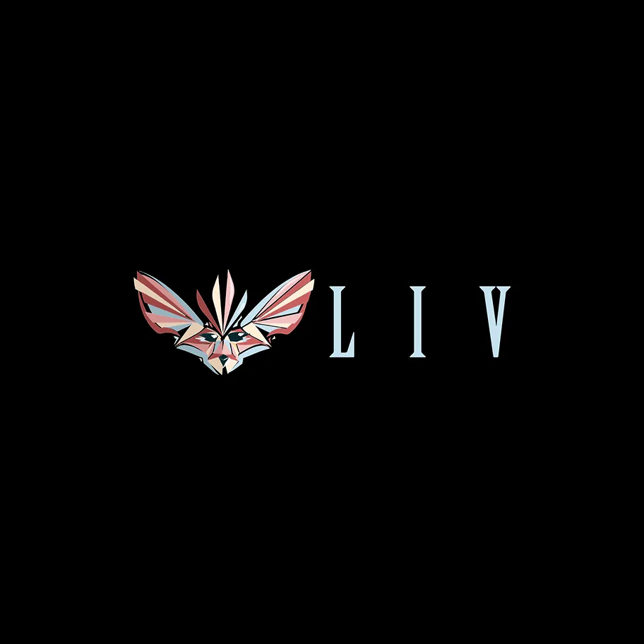
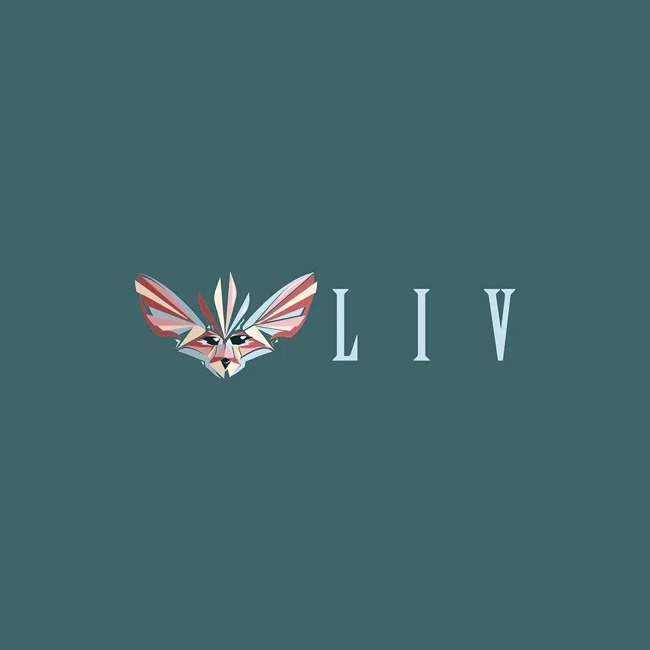
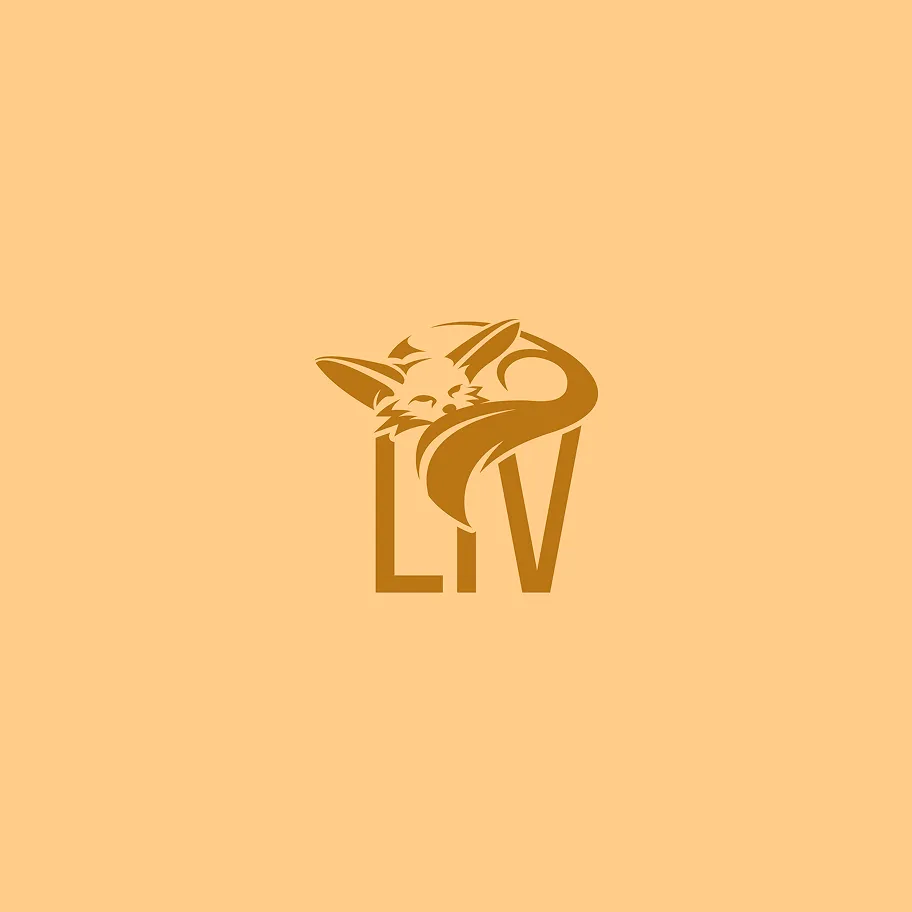
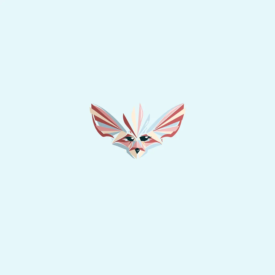
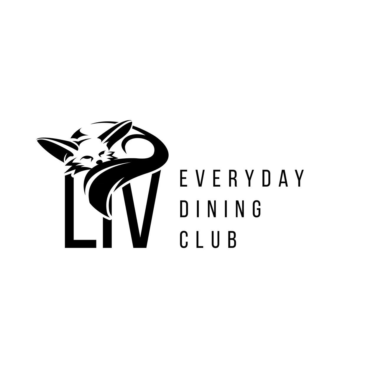
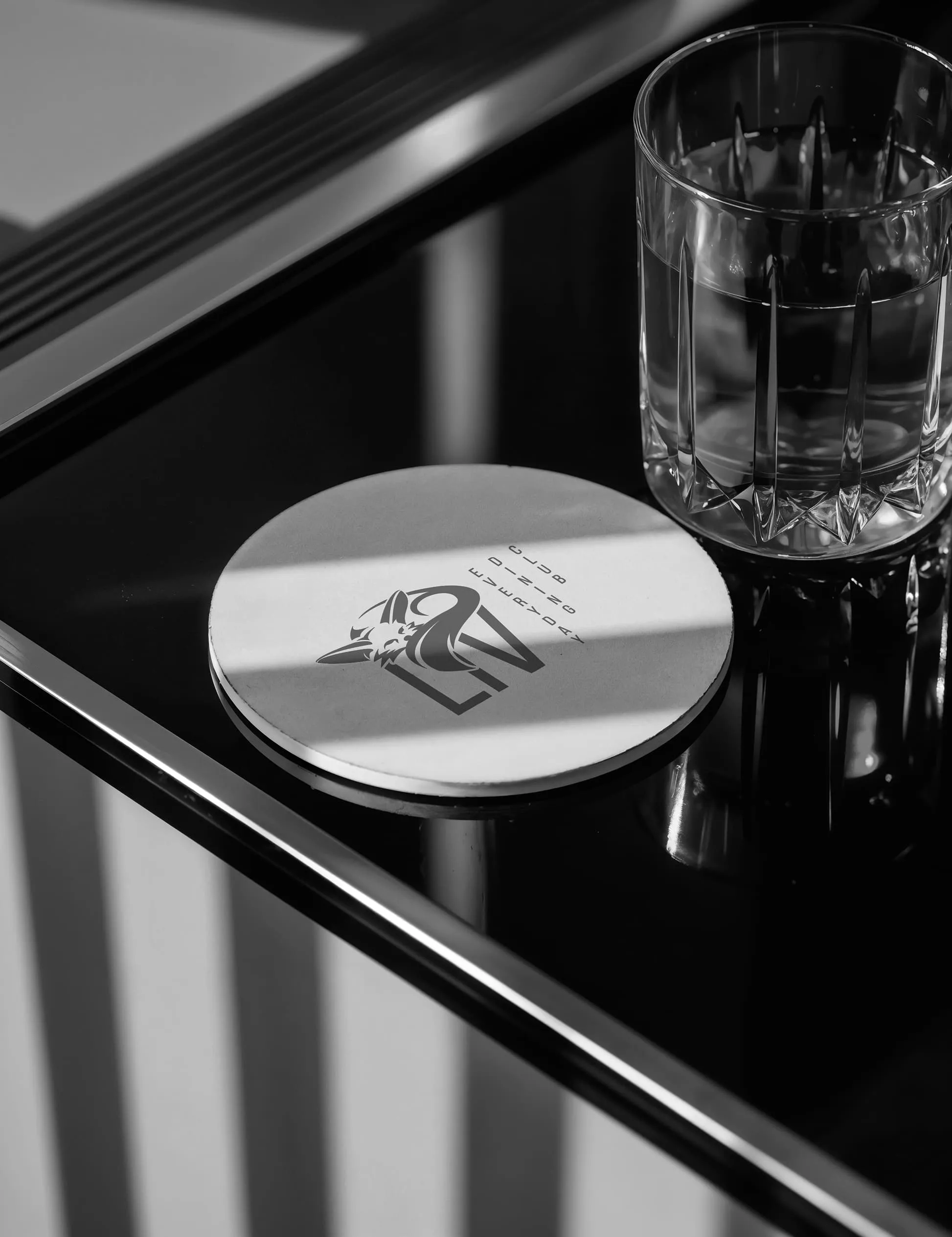
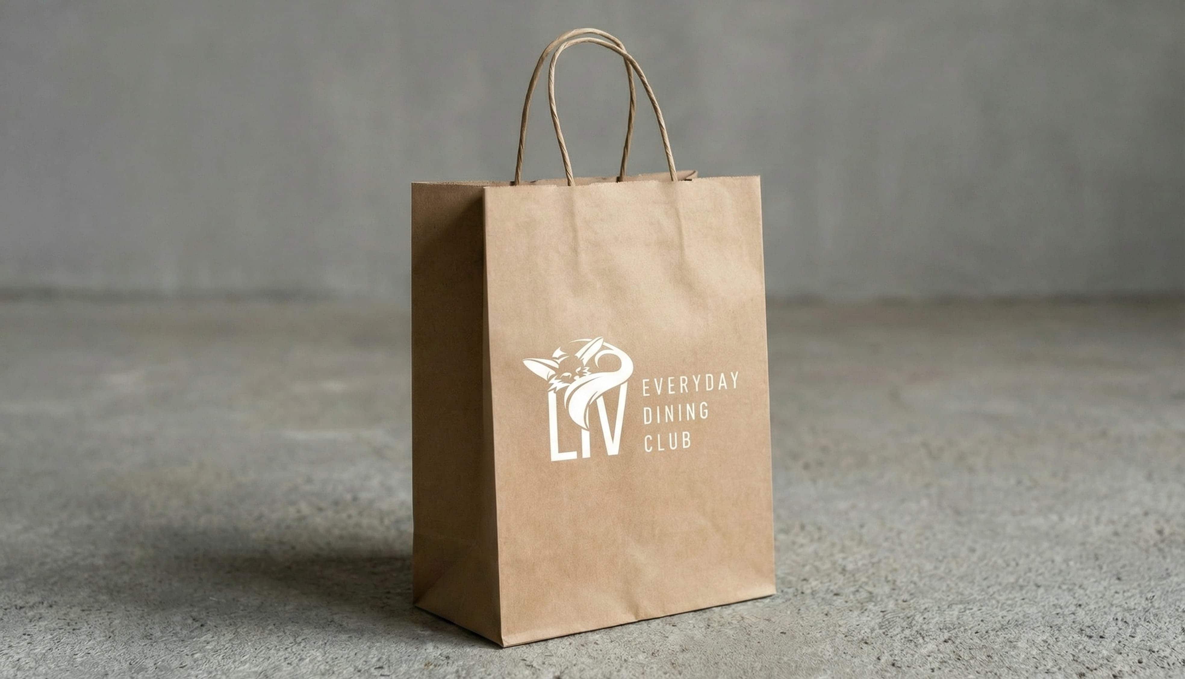
Multiple logo variants ensure flexible use on all surfaces and media.
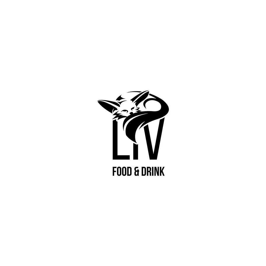
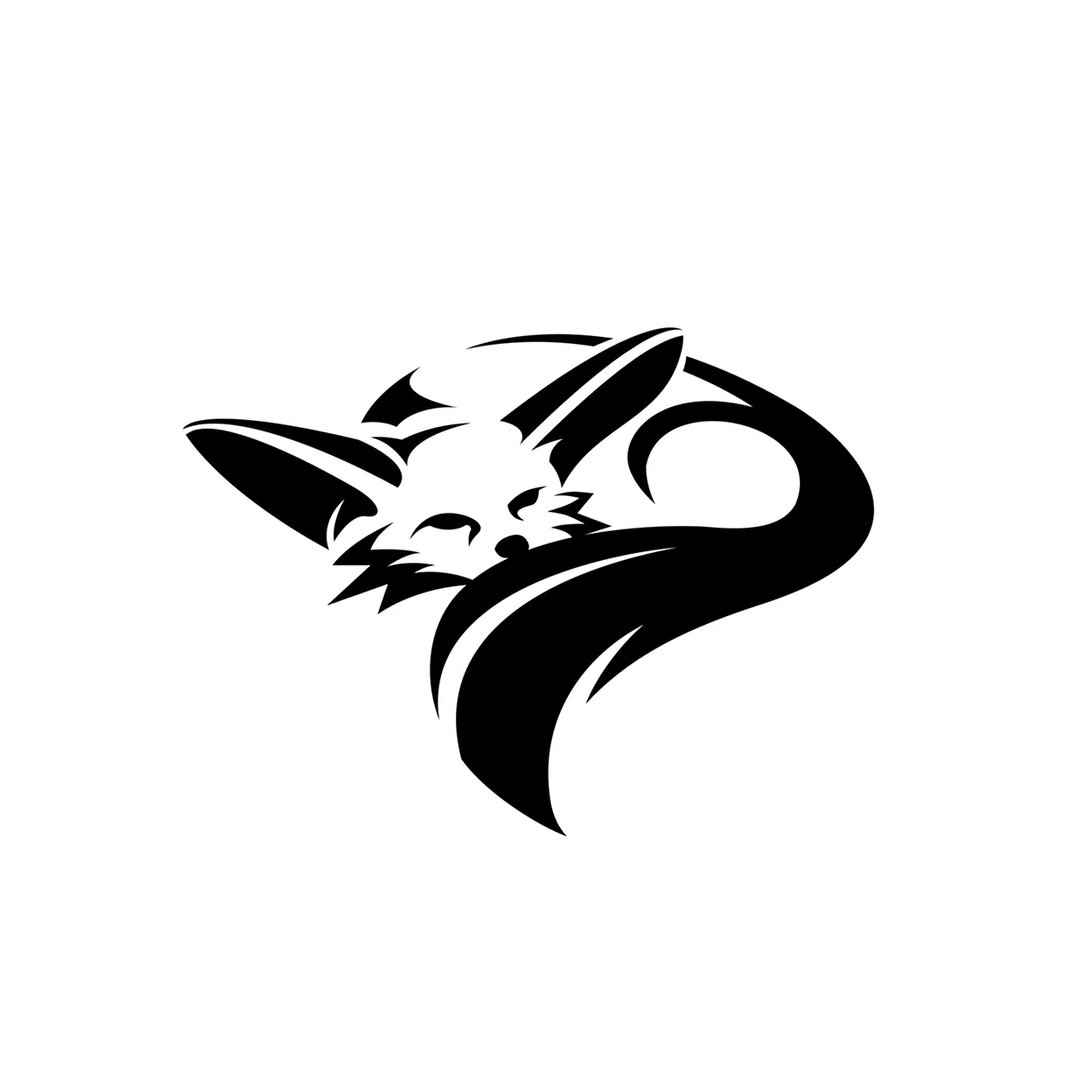
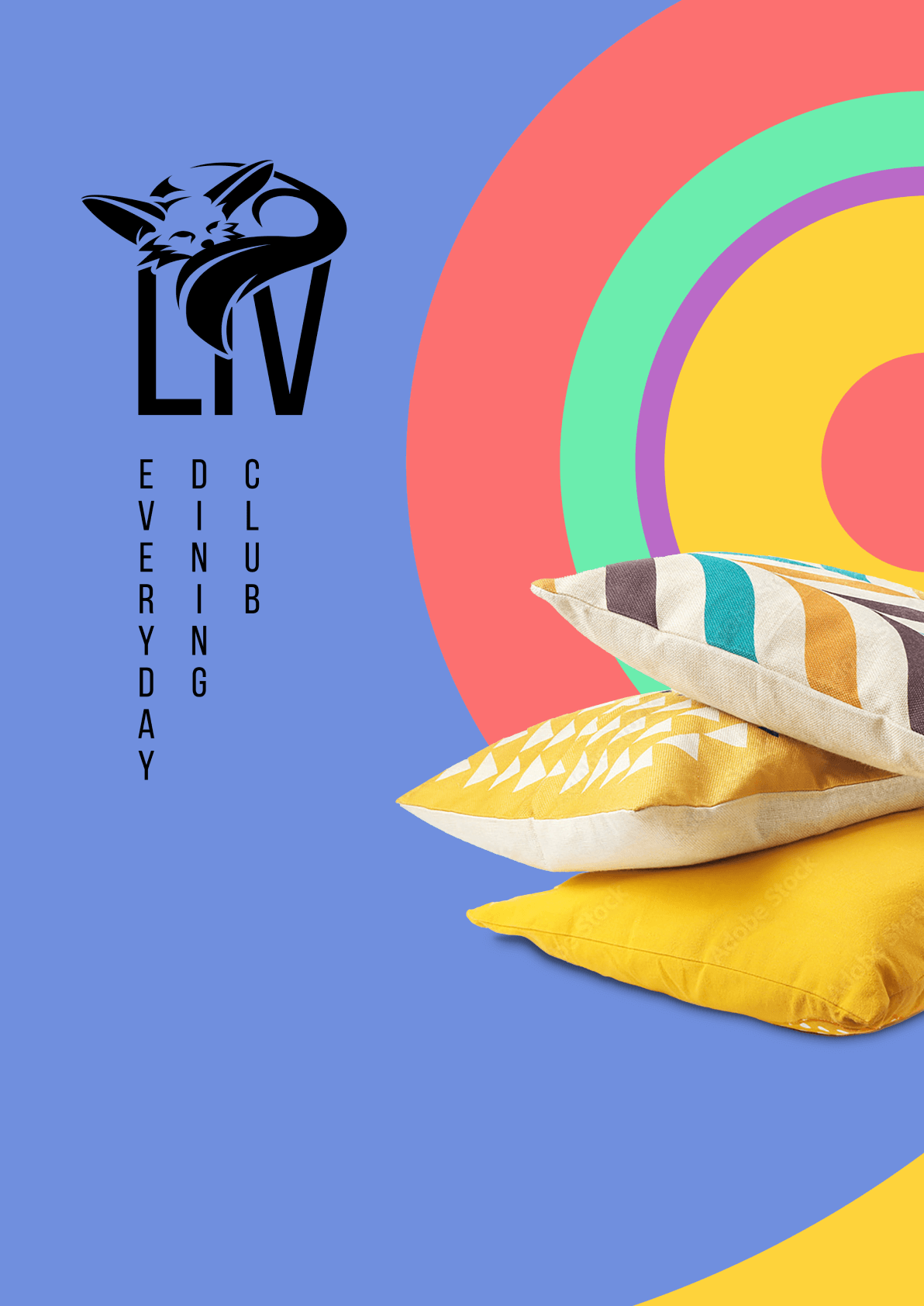
For the final logo design, we opted for a black-and-white version. It emphasizes minimalism and simplicity. The desert fox as the central motif symbolizes care, life, and the ability to turn any place into a home. Its large ears represent natural imperfection (wabi-sabi), while its curled posture conveys a sense of belonging and well-being—core values of LIV.
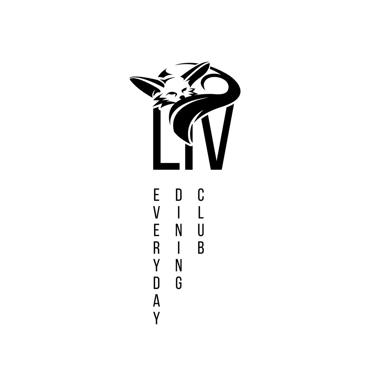
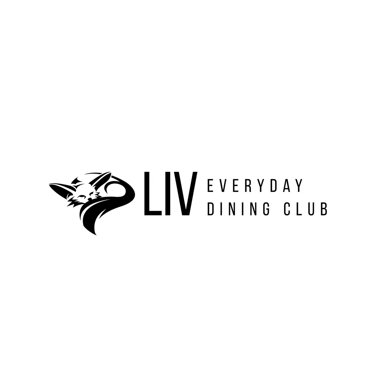
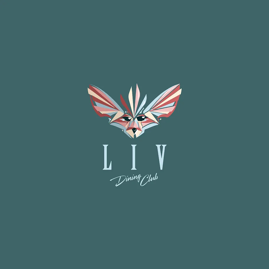
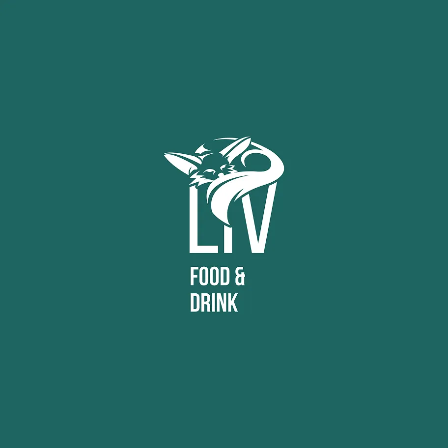
Multiple logo variants ensure flexible use on all surfaces and media.
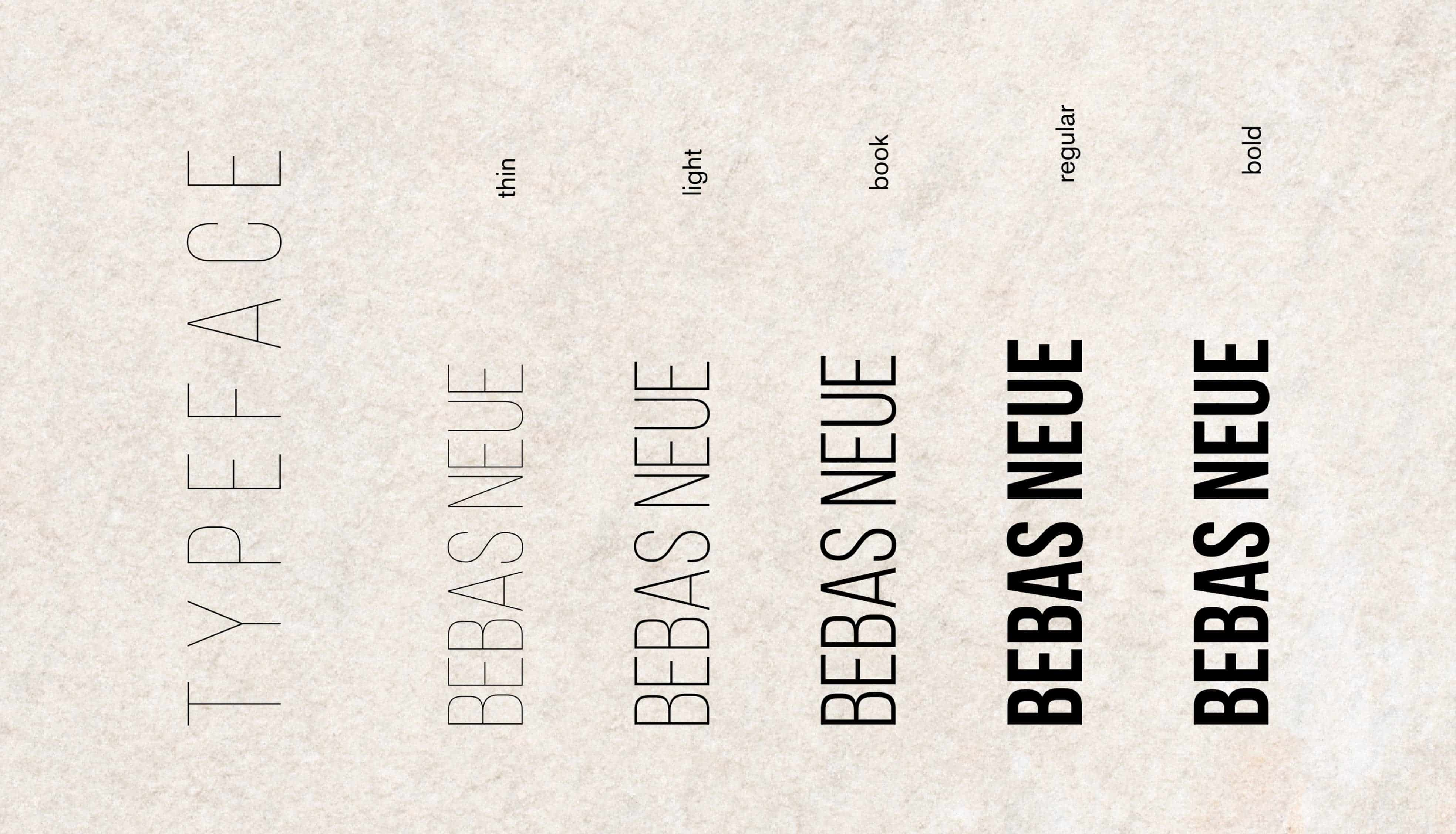
The primary font used for the word mark and the main typography is "Bebas Neue," which conveys clarity, modernity, and a strong visual presence.
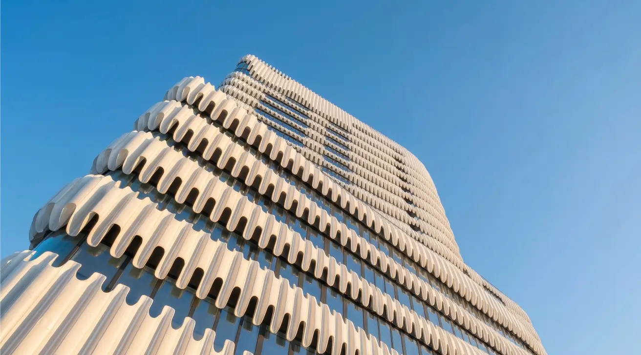
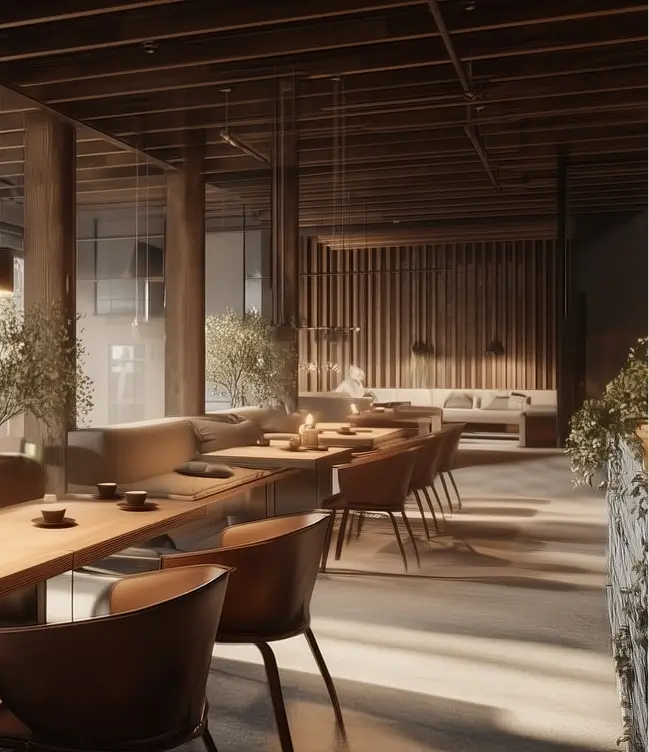
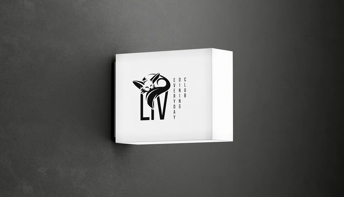
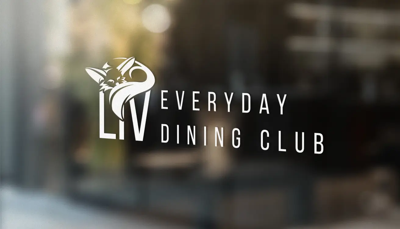
The logo works well on all media and blends harmoniously into the robot restaurant, which combines natural materials with modern technology.
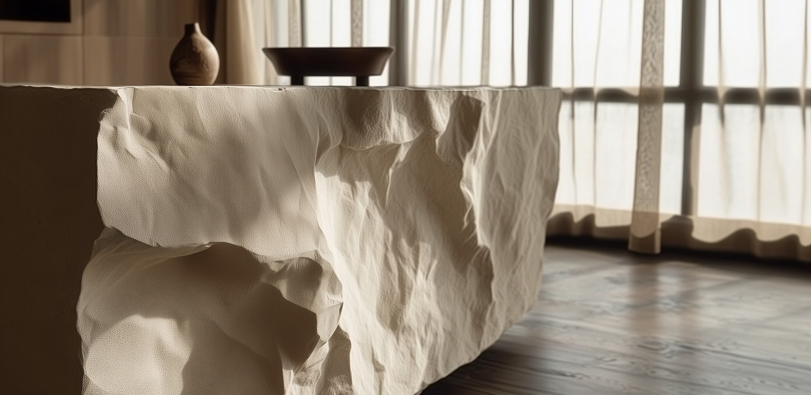
The natural materials and organic shapes of the robot restaurant inspired the final, distinctive logo.
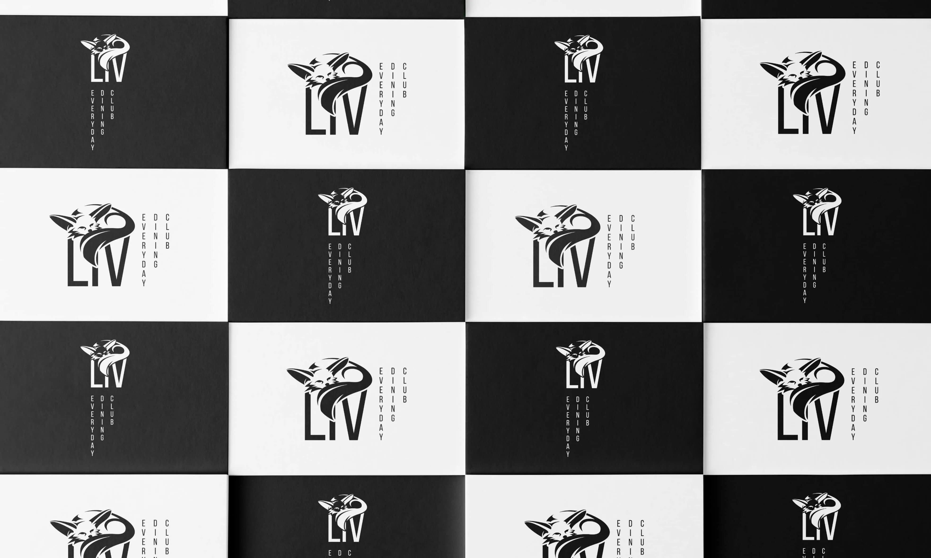
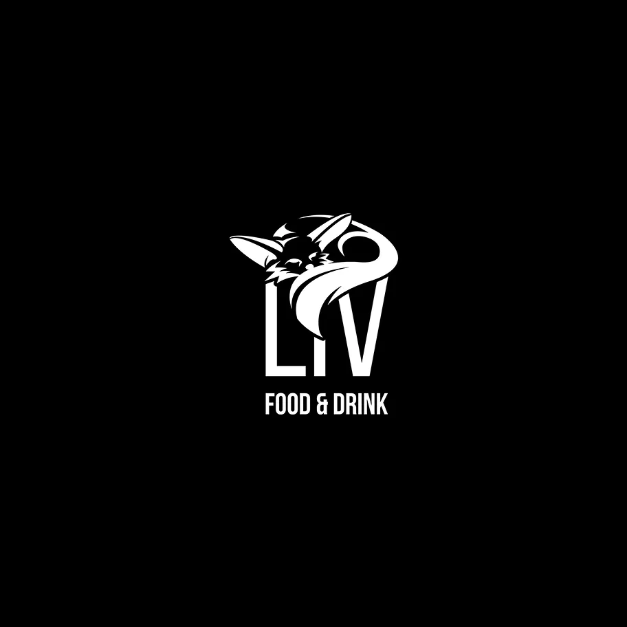
The design of the logo family with variable signet and typography combinations allows for flexible use of the logo for different applications in the restaurant.
In addition, a style guide was created that clearly defines the logo, color scheme, typography, and style elements.


The menus were designed in pastel colors and feature natural shapes of leaves and flowers.
Were we able to inspire you with our work?
Tell us briefly and concisely about your project. It doesn't matter whether you only have a rough idea or a sophisticated concept. We look forward to hearing from you and then let's have a chat!
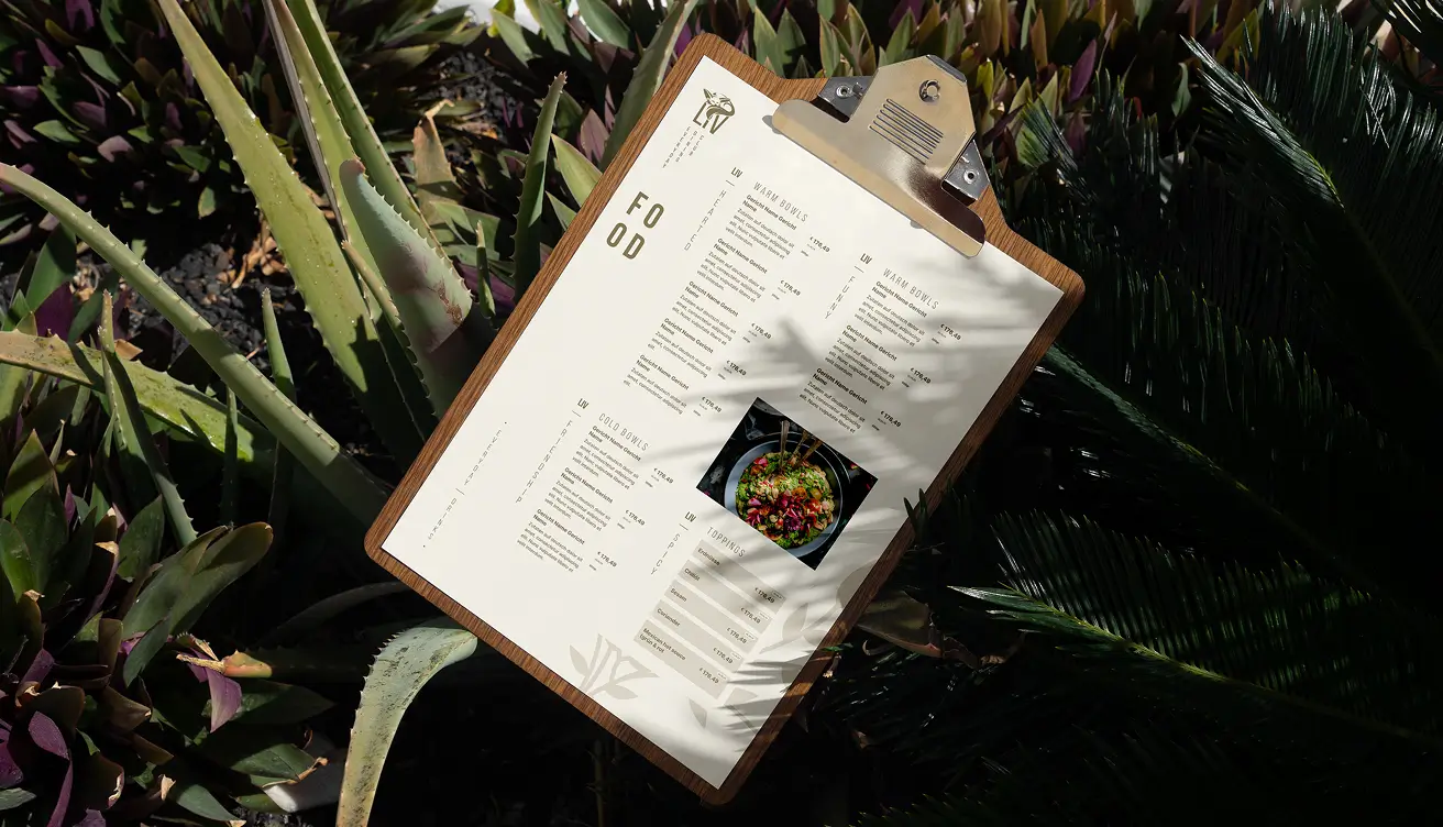
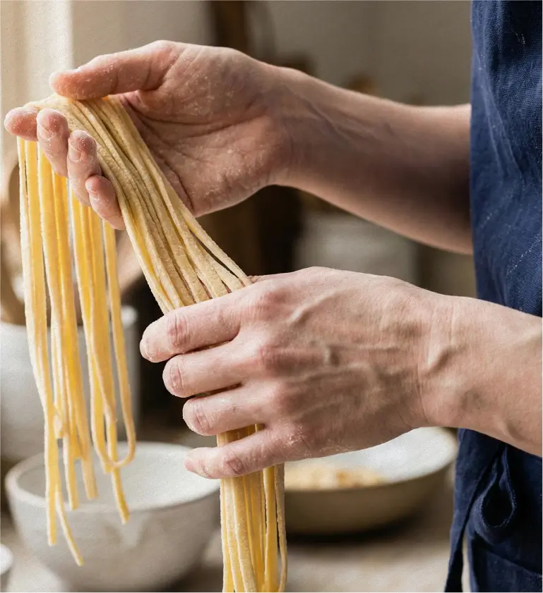
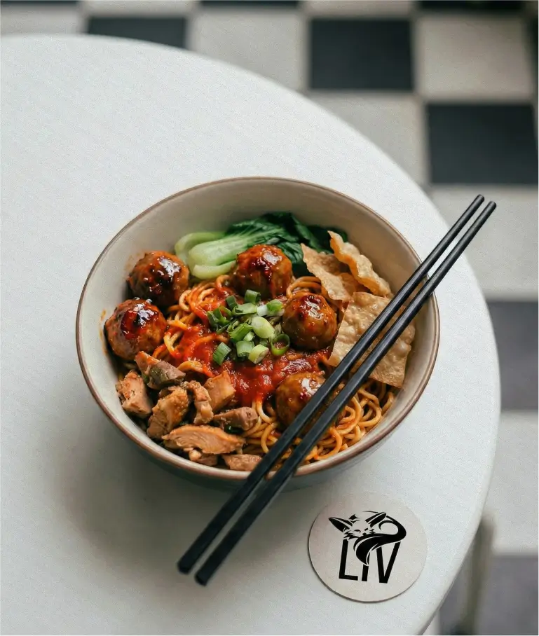
A menu card of up to four pages was designed for the robot restaurant, which picks up on the corporate design and consistently transfers the brand identity to the guest experience.
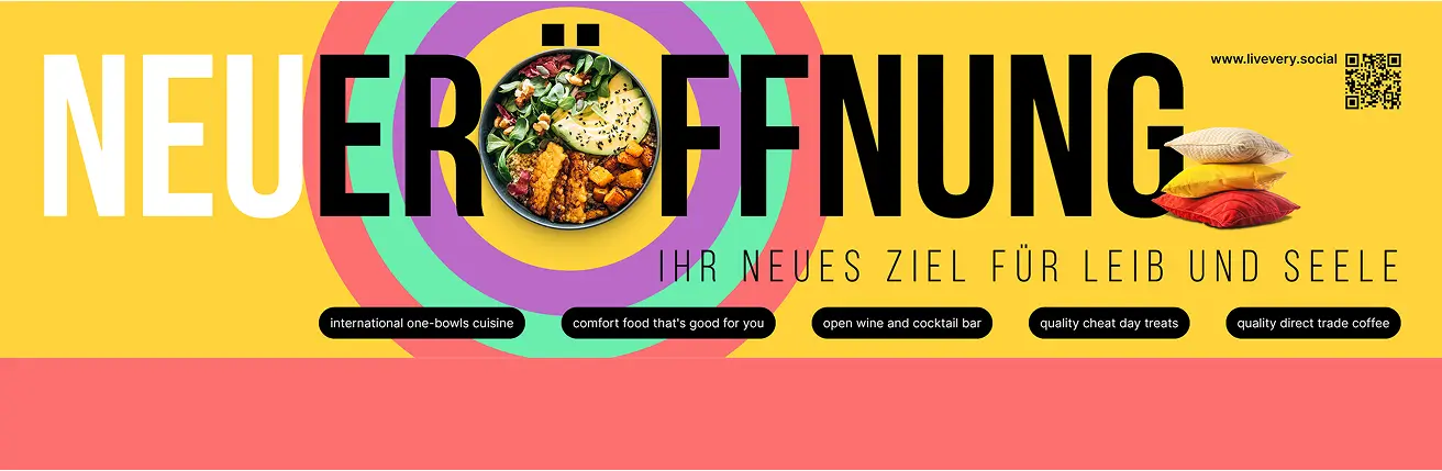
The window decals in various designs and colors add a colorful accent that showcases the diversity of Levantine cuisine and natural elements in a modern style, while also conveying a feeling of home and relaxation.
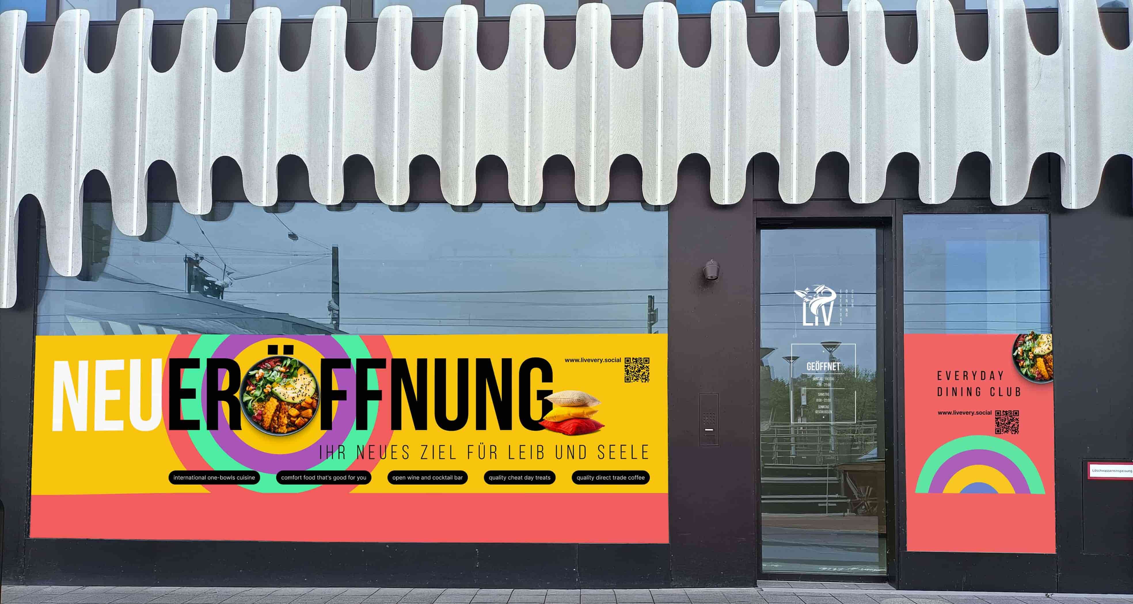
The bright window stickers on the RKM 740 and the logo on the exterior windows create a dynamic effect and blend perfectly into the unusual façade architecture.
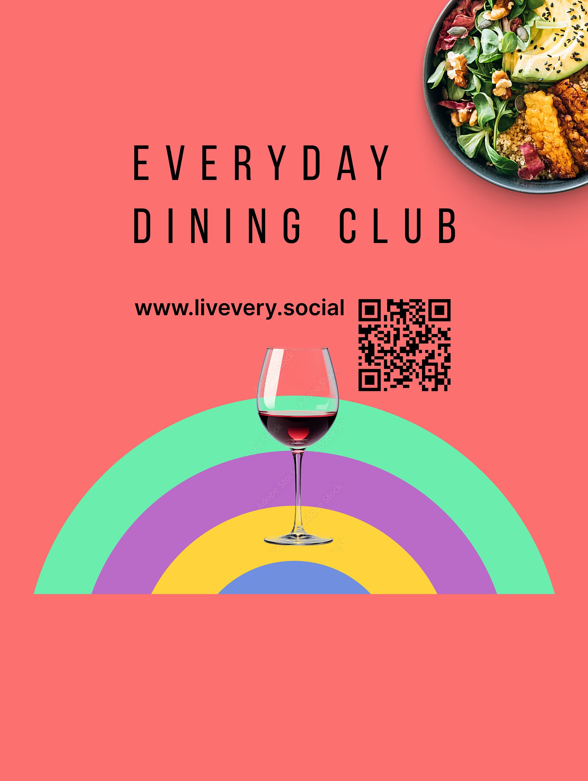
An advertising banner as a modern eye-catcher. It not only stands for creative advertising, but also allows everyday design to shine in a completely new light.
Where taste meets atmosphere
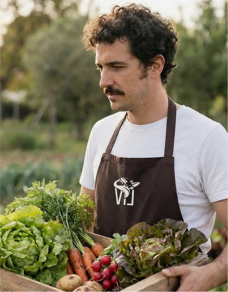
LIV uniquely combines nature and modernity. Organic shapes, wood, and sustainability characterize its appearance, while technology subtly works in the background as an enabler, creating a harmonious blend of bohemian style, wabi-sabi, and biophilia. The design reflects Levantine cuisine and conveys a feeling of home—a cozy living room atmosphere for guests.
At the heart of the identity is the fox in the logo: a symbol of care, life, and transformation. The final black-and-white design combines minimalism and clarity with timeless elegance, making LIV unmistakable.
From the name and logo to the complete style guide, LIV was created in an iterative process. Every color choice—from bright turquoise to sand and earth tones to dark brown and beige—as well as every shape and detail was carefully tested to bring out the brand's personality: free, lively, natural, and modern at the same time.
Share our work