


The logo development for Bücker GmbH took many directions, but one thing remained constant: the striking purple. This bold color gives the brand an unmistakable presence and reflects the strength and professionalism of the company.
The sans serif font provides a clear structure and outstanding legibility. Its elegant, rounded shapes give the site a modern, distinctive look. In headlines and striking text passages, it creates an impressive visual presence and underlines Bücker's strong brand identity.
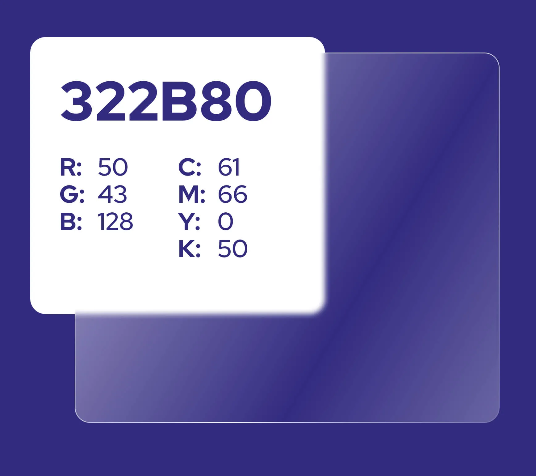
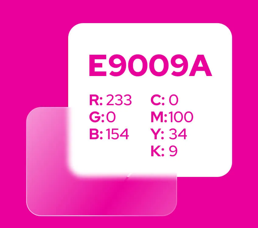
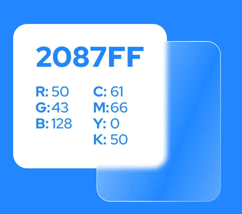
The color scheme for Bücker GmbH combines strong but balanced tones that give the brand a modern and professional look. A deep purple dominates as the main color and conveys strength, self-confidence and creativity. It is complemented by an intense pink, which sets lively highlights as an accent color and emphasizes important elements without being overpowering. A clear blue provides a calming balance and gives the overall look a fresh, harmonious note.
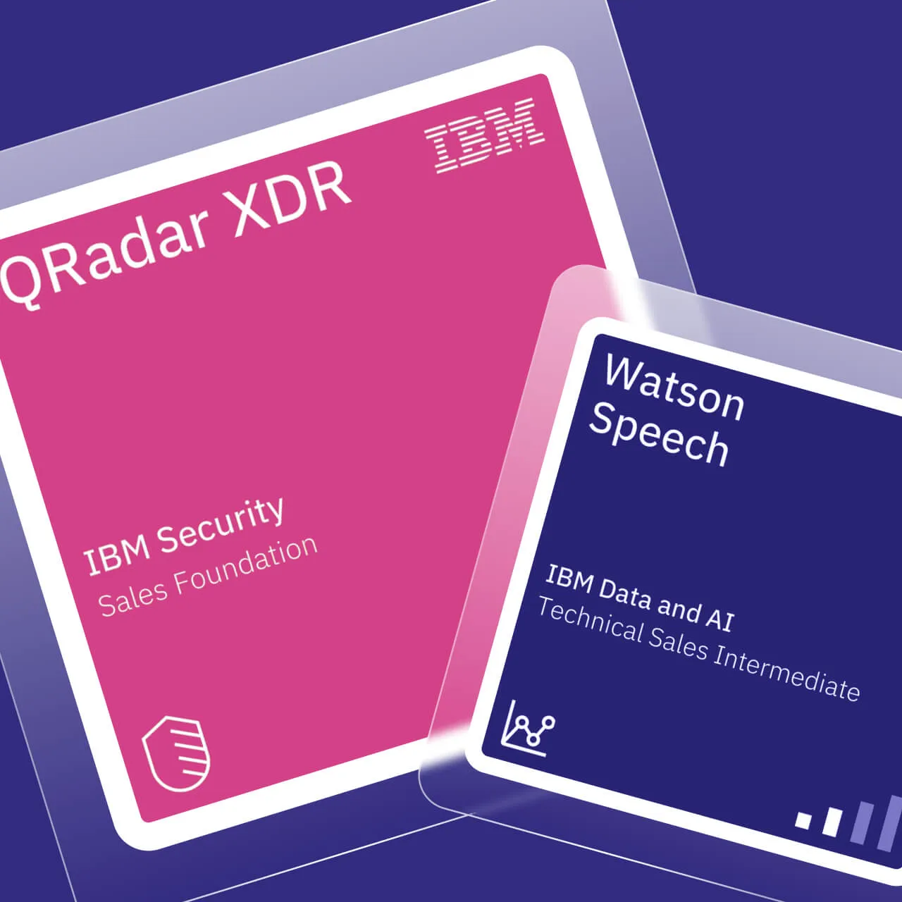
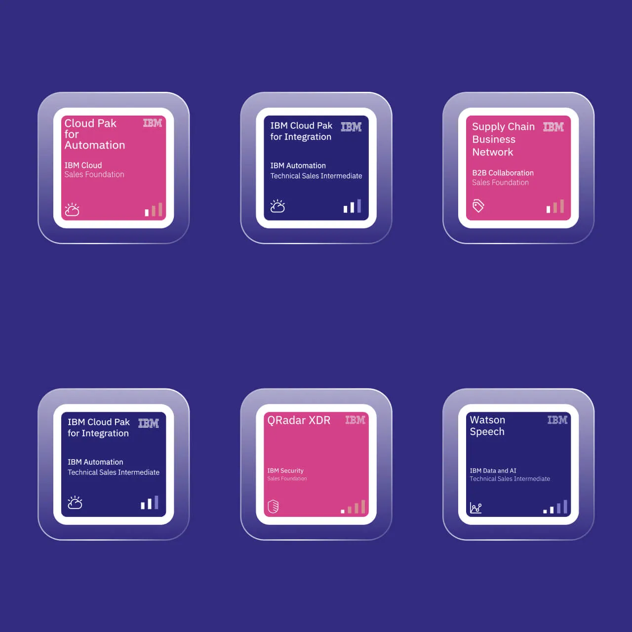
We were using glass tiles long before Apple made them a trend. These minimalist, transparent elements not only give the site a futuristic look, but also allow the content to literally float. They bring an unmistakable elegance and technical sophistication to the design.
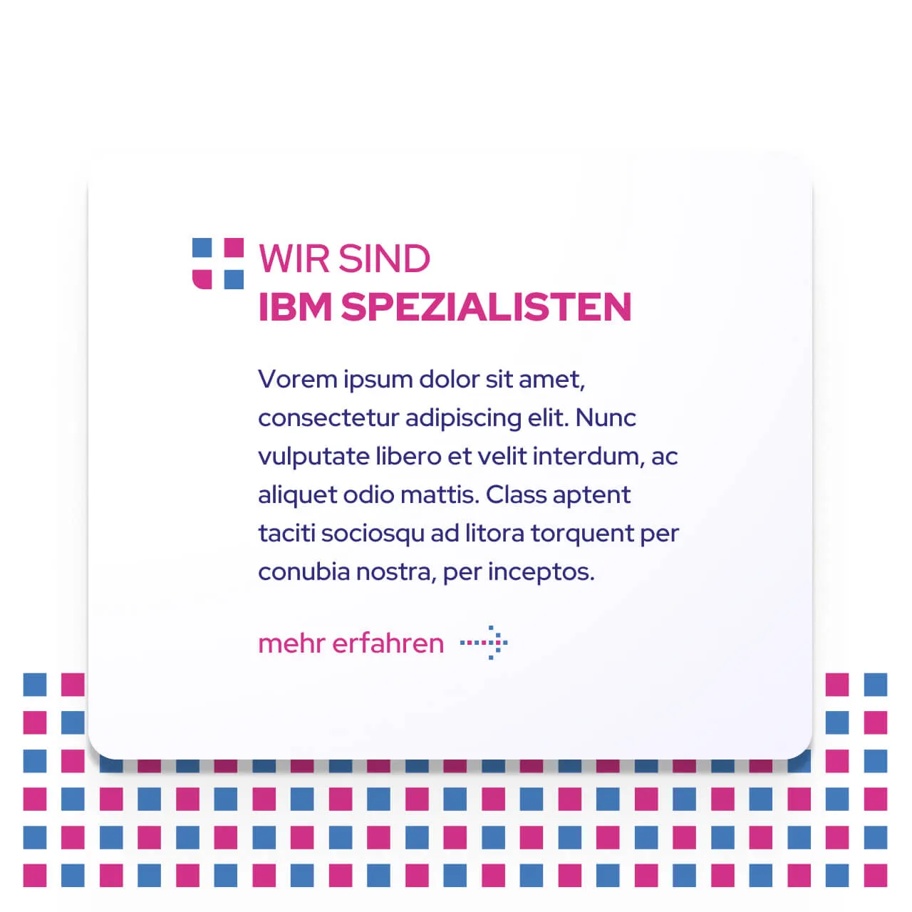
PT Sans Regular is light, restrained and reader-friendly. It takes over where Nunito has opened up the space. The interplay is like a dialog of form and content, loud and quiet in perfect alternation.
Were we able to inspire you with our work?
Tell us briefly and concisely about your project. It doesn't matter whether you only have a rough idea or a sophisticated concept. We look forward to hearing from you and then let's have a chat!
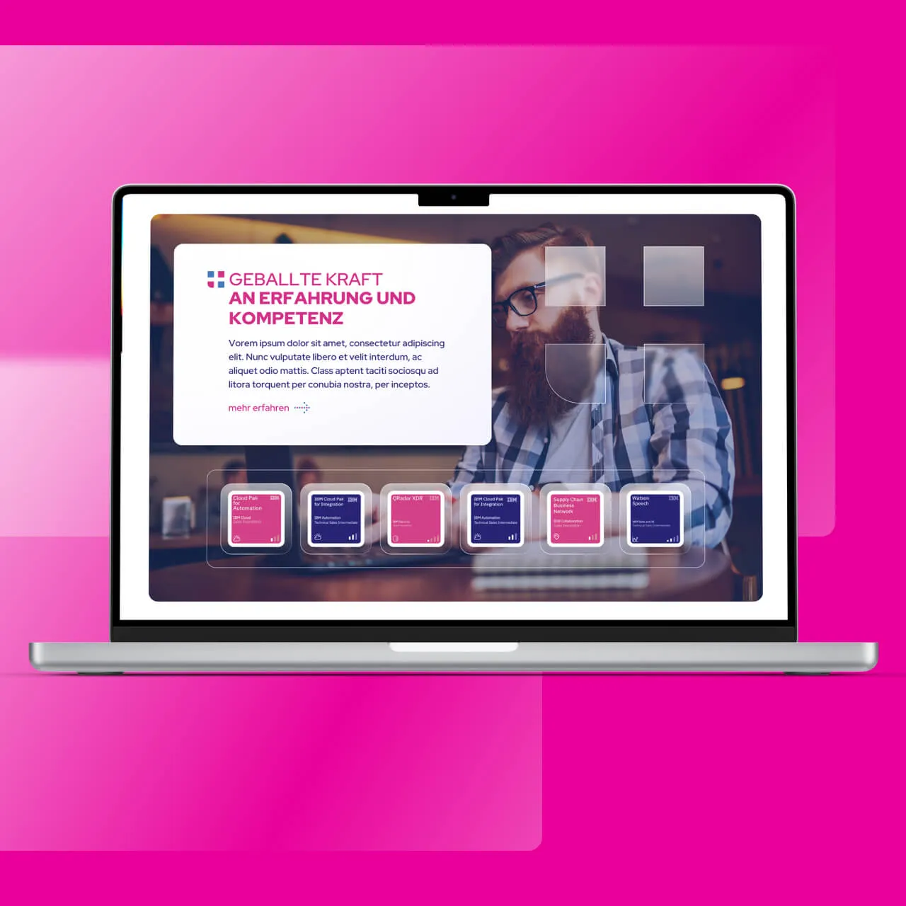
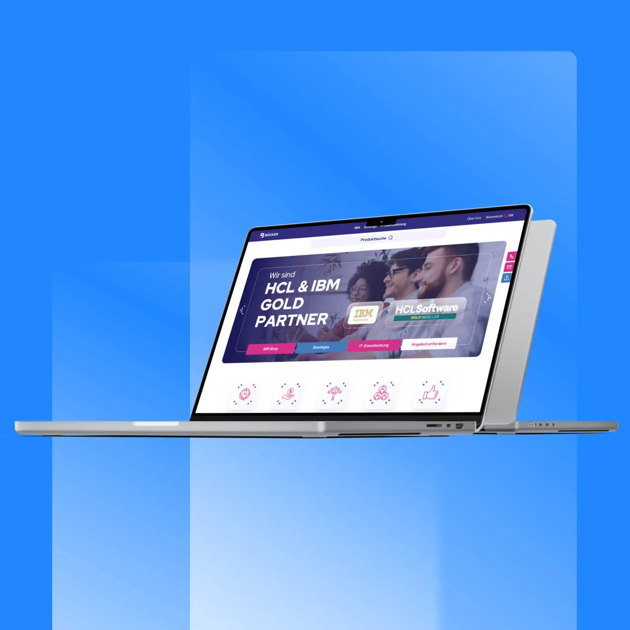
The iconography is simple and intuitive, perfectly tailored to the target group. It picks up on the elements of the logo and translates them into clear, easy-to-understand symbols. This keeps the design modern and emphasizes the brand identity.
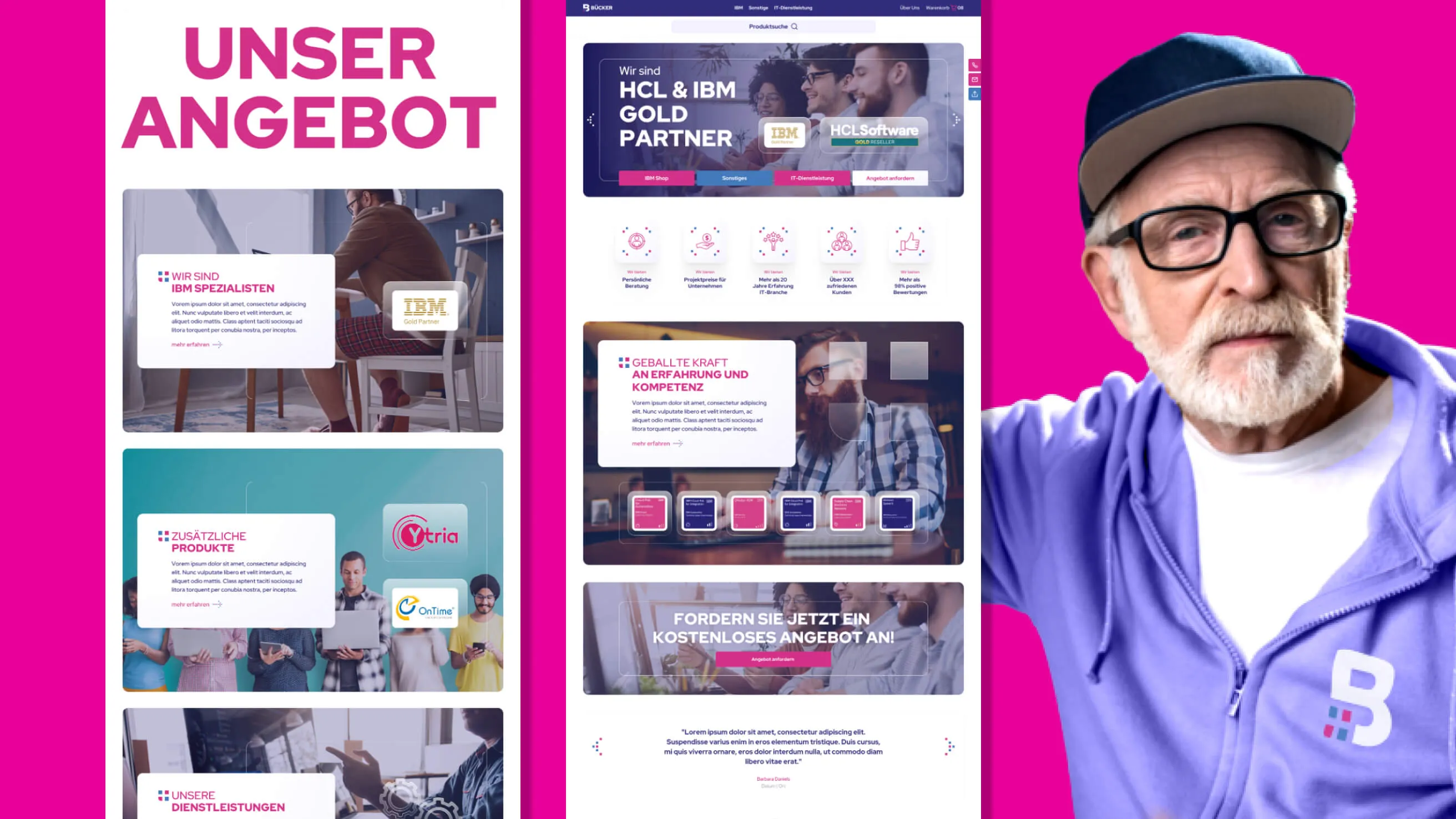
The visual language was completely rethought, with the focus on people. A "cool" grandpa was chosen as a sympathetic figure to show that even complex topics are approachable and accessible. This character brings personality to the design and is also used in social media to create a modern, inviting atmosphere.
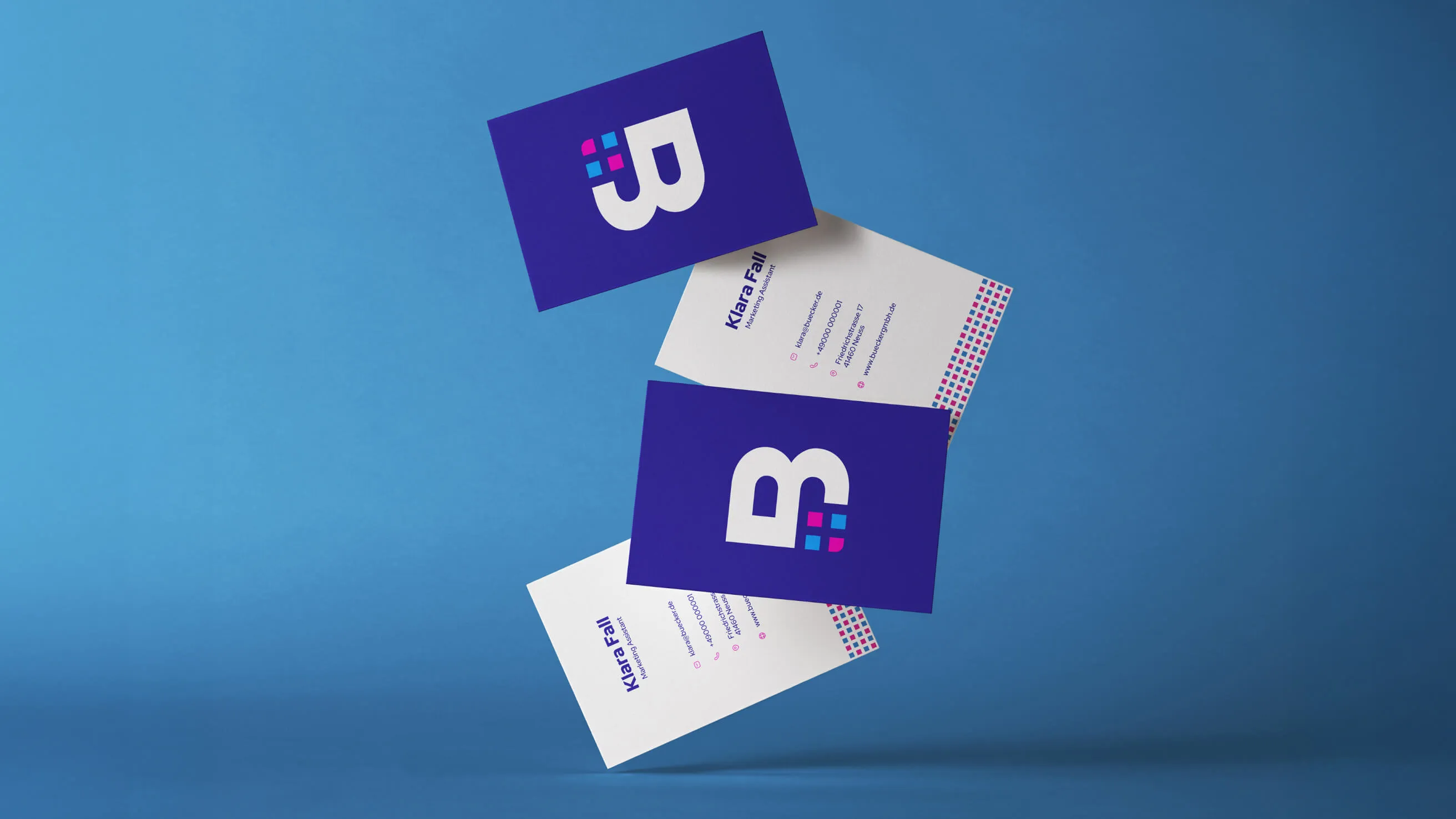
The new design is striking and easy to use. Whether business cards, stationery or social media posts.
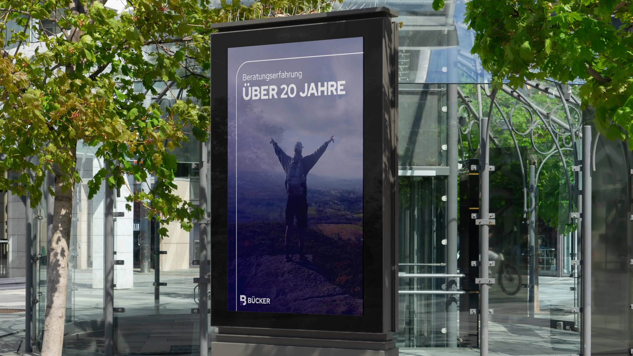
An advertising banner as a modern eye-catcher. It not only stands for creative advertising, but also allows everyday design to shine in a completely new light.
From underdog to industry power with AI
Net? Virtually invisible. No conversions, hardly any visitors, no organic reach. Anyone who found the site had the feeling that they were visiting a small local provider. Not a strategically positioned license and IT service partner with a national reach. The discrepancy was obvious. It was time to correct the picture.
Our approach was clear. No readjustments, no digital make-up, but a complete new start with attitude. The aim was to make Bücker appear larger, more structured and more confident in the digital space, without any pretense, but with a clear statement. We developed a new corporate identity with a well thought-out logo, a targeted color code and precisely chosen typography. The new look should not only be appealing, but above all work. Build trust, provide orientation, prepare the next click, ... prepare for conversion.
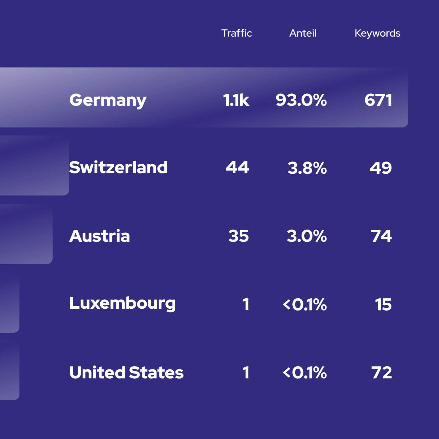
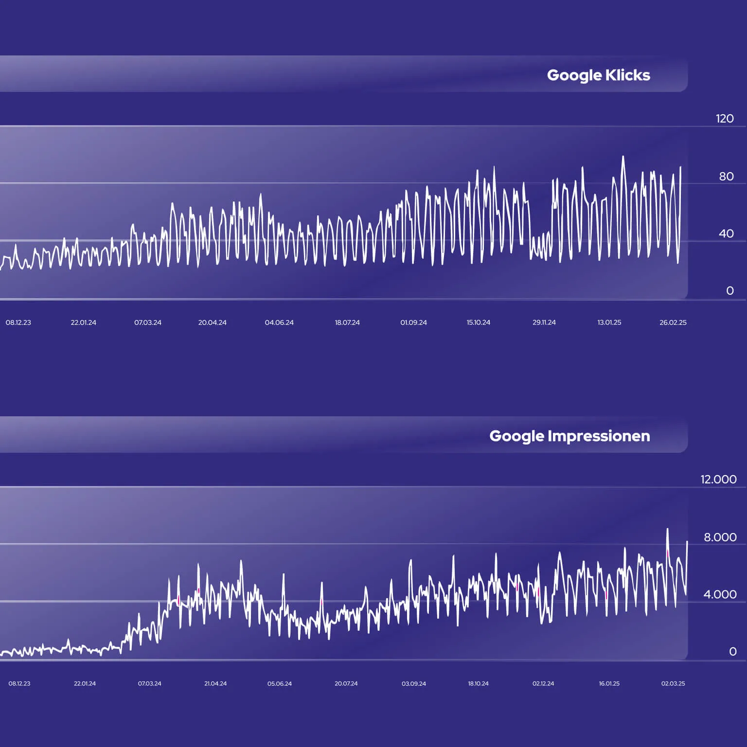
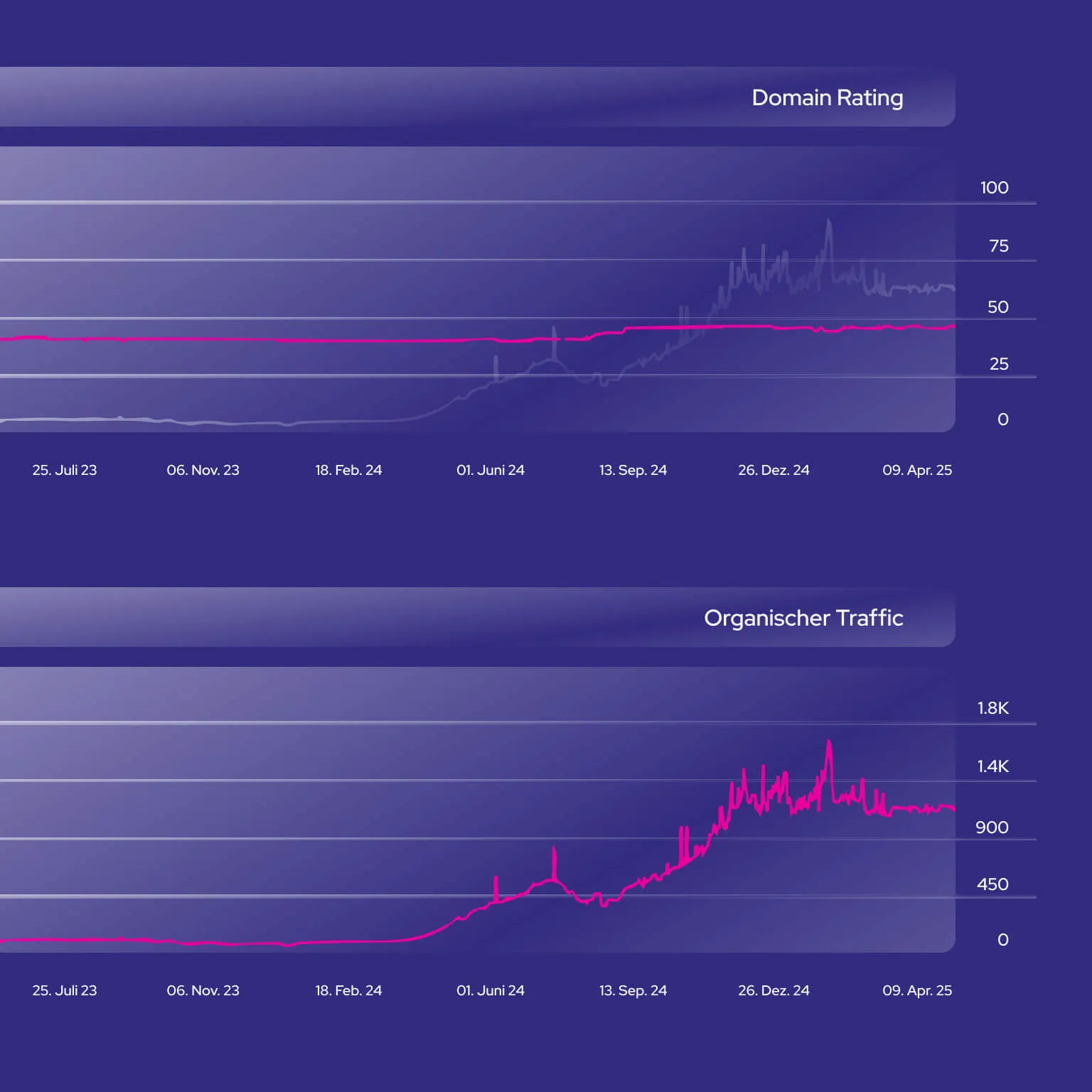
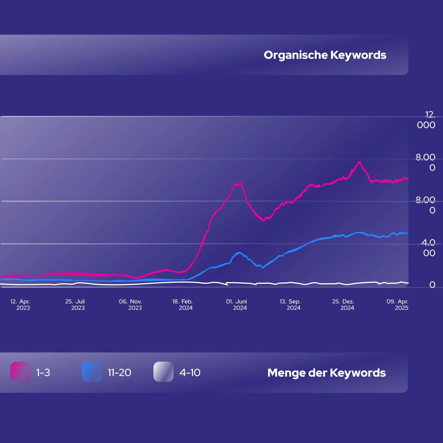
The centerpiece: a website that doesn't look like an IT service provider, but like a digital sales professional. Not a classic service structure, but a system that works like a store at first glance. Over 23,000 IBM licenses were integrated in a large and visible way, including list prices. With the clear signal: We do it better. Users browse, compare and find the right product. Now the highlight: the purchase process does not end with a checkout, but with a contact form! The start of a personal consultation. The perfect bridge between automated guidance and individual support.At the same time, a technical foundation was created in cooperation with the Berlin system house Dacher Systems (the entire backend was custom-written by them) that also convinces Google. Each individual license has its own subpage. AI-generated, strategically structured, with maximum relevance for the search engine. The result is a massive increase in organic traffic. From less than 50 monthly visitors to over 1,200. Over 1,000 keywords in the top 100. And the best part? All of the traffic comes from German-speaking countries. Without ads, without campaigns, without an advertising budget ;)Today, the new website generates a stable double-digit number of qualified inquiries per month. The site shows what the company does. It positions, filters and activates. It makes it clear why you are in the right place. And it works. As a tool, as a brand ambassador, as a digital sales arm. Bücker did not have to reinvent itself. They just had to start becoming more visible - more daring. Today, there is a brand that delivers digitally what it has long promised professionally. Clear, self-confident, structured. And ready for whatever comes next.
Share our work
