FS Animal Health
Tools used
For a shop with a long history specializing in daily care, therapy, and nutrition for horses, a website was developed that offers clearly structured product cards, a quick product search, and a user-friendly interface. Visually, the website was given recognizable design patterns, consistent typography, and naturalistic horse photos that complement the overall look.
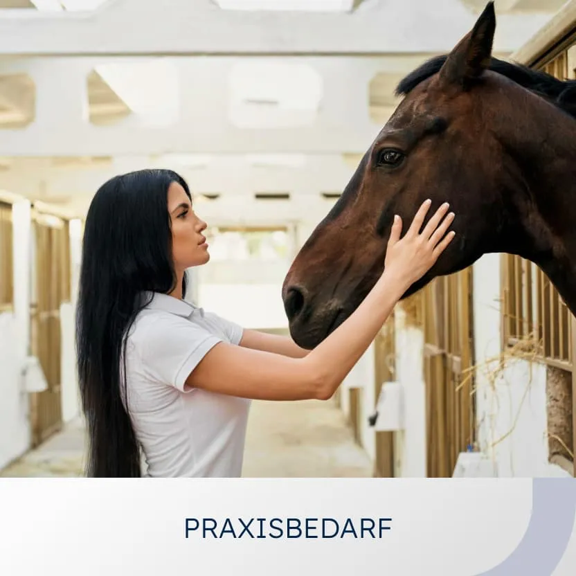
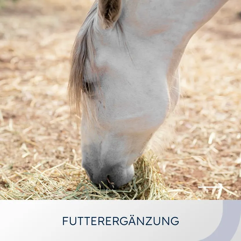
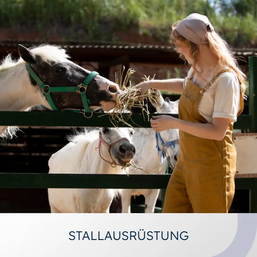
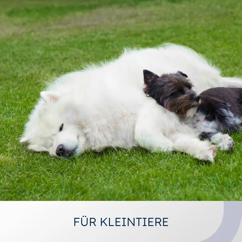
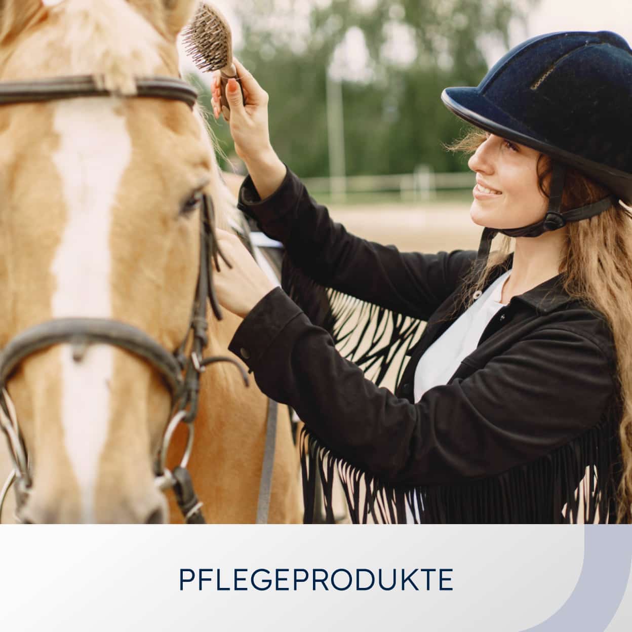
The online shop brings together a wide range of product groups that are specifically tailored to the needs of customers.
Thanks to the website redesign, all offers are now clearly presented, clearly structured, quick to understand, and easy to experience firsthand.
Clear visualisation and understandable product information support the shop's mission: to enable horses to live healthier and longer lives by making it easy for customers to discover the right products for care, therapy and nutrition.
The brand identity is reinforced by a consistent visual system: a circular pattern subtly structures the background and emphasizes the Animal Health logo, while clear typography, a harmonious color palette, and high-quality images create a professional, trustworthy, and at the same time emotional appearance that conveys expertise in the field of equine health.
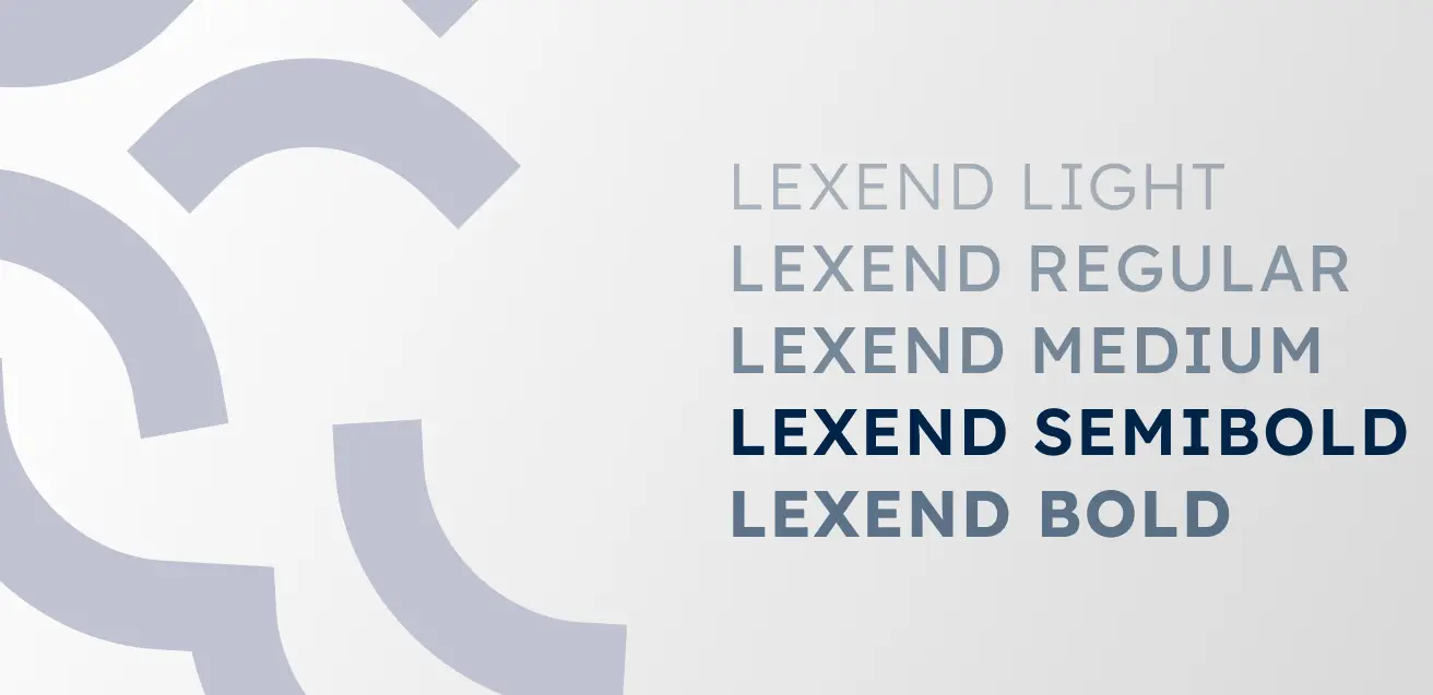
The Lexend grotesque font was chosen as the main font. It guarantees optimal legibility and clarity and gives all texts a modern, appealing look.

The Kristi display font is used for slogans and gives the design a handcrafted, natural aesthetic that emphasizes authenticity and closeness to nature.
The online shop brings together various brands, offering a wide range of high-quality products for the well-being of horses.
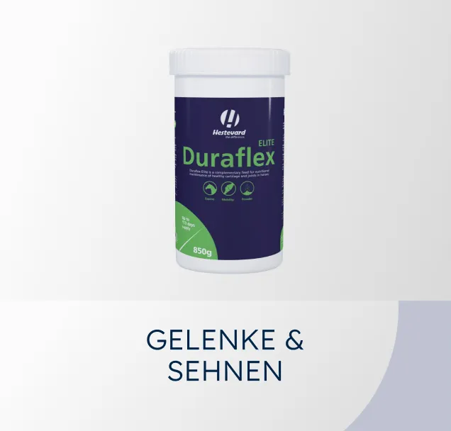
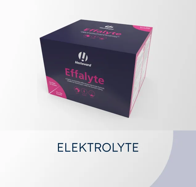
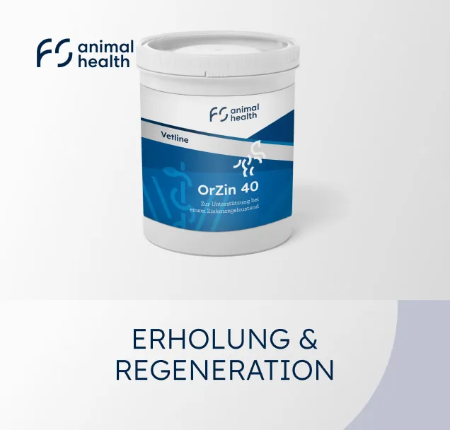
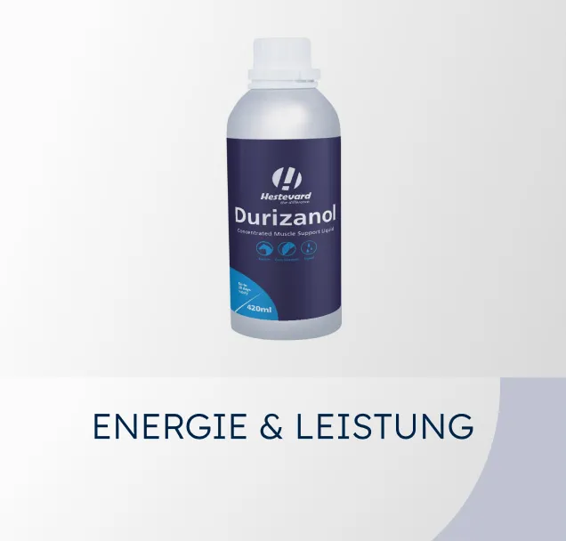
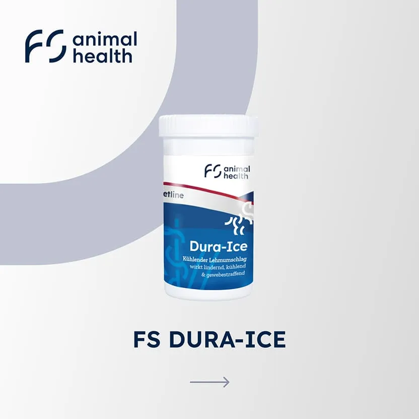
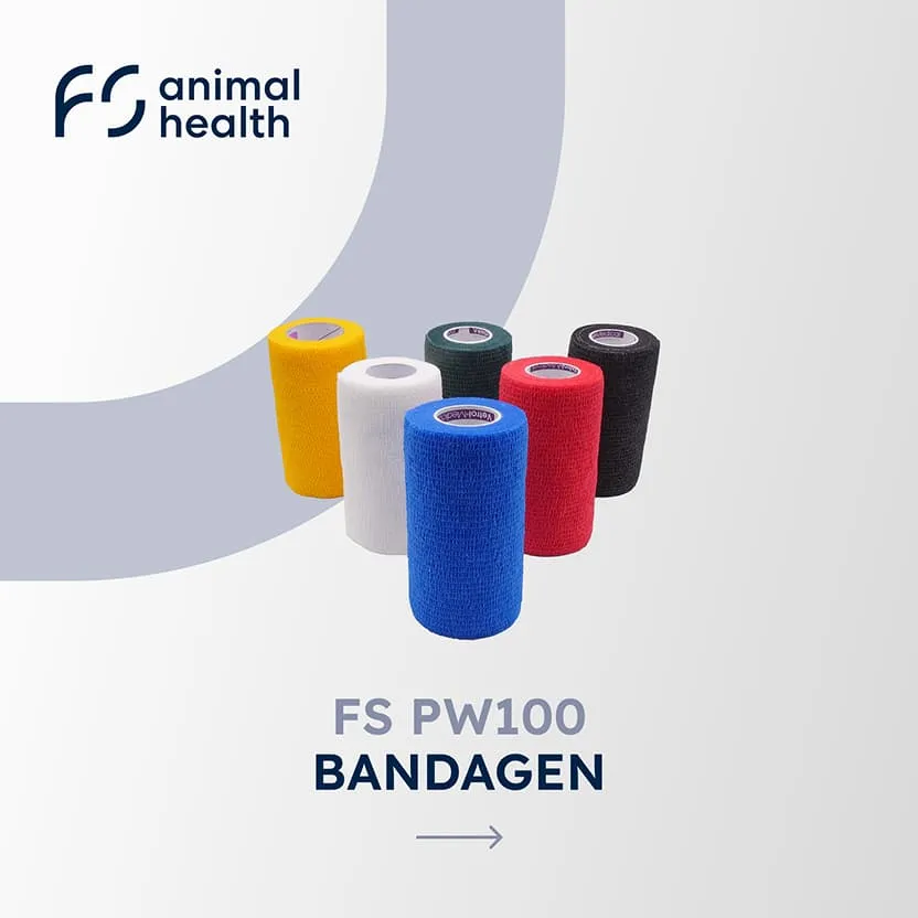
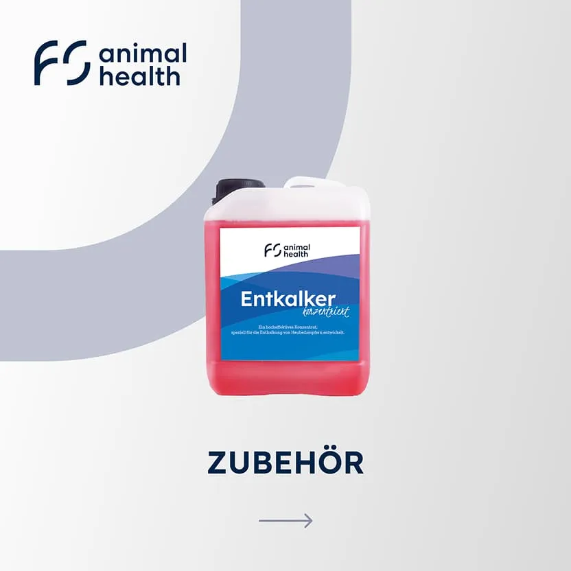
The redesign visually unified products from different brands with eye-catching 3D visualizations. Each product card is designed in line with the website's corporate design, ensuring that the presentation is clear, appealing, and effective in driving sales.
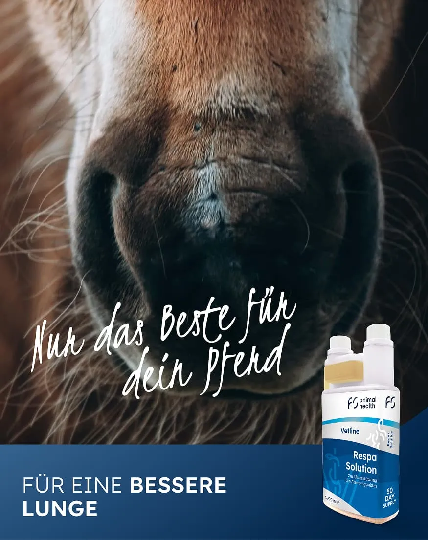
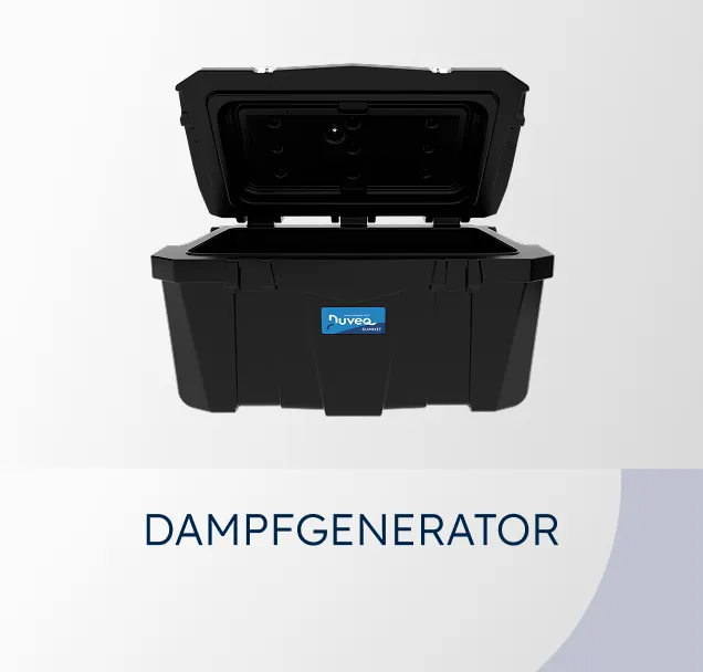
The design of the landing pages was redesigned for several brands, including Nuveq, with a particular focus on one product in order to present it in a particularly attractive and eye-catching way.
Were we able to inspire you with our work?
Tell us briefly and concisely about your project. It doesn't matter whether you only have a rough idea or a sophisticated concept. We look forward to hearing from you and then let's have a chat!
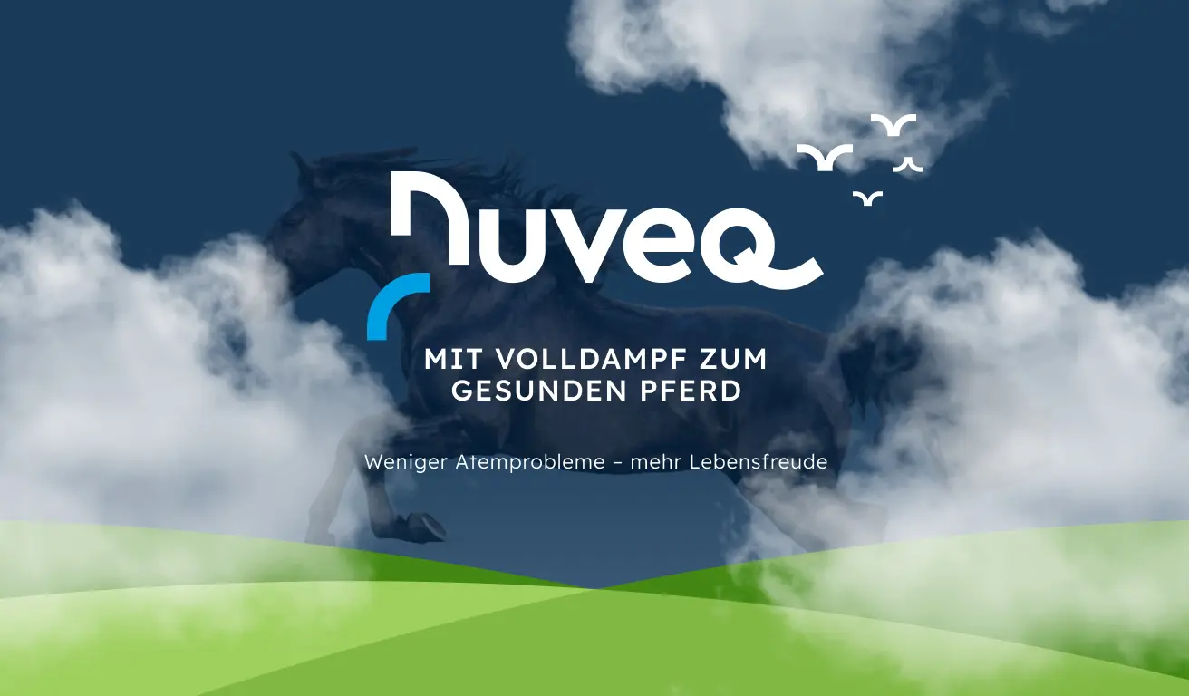
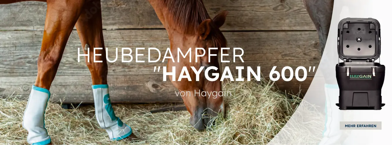
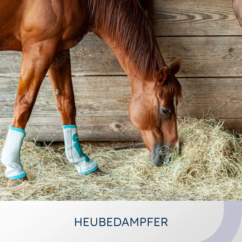
The design focuses on the three brand colors, the characteristic typography, and clear, simple geometric shapes. A subtle fog effect picks up on the central product—the steam generator—and gives the page a distinctive, atmospheric appearance.
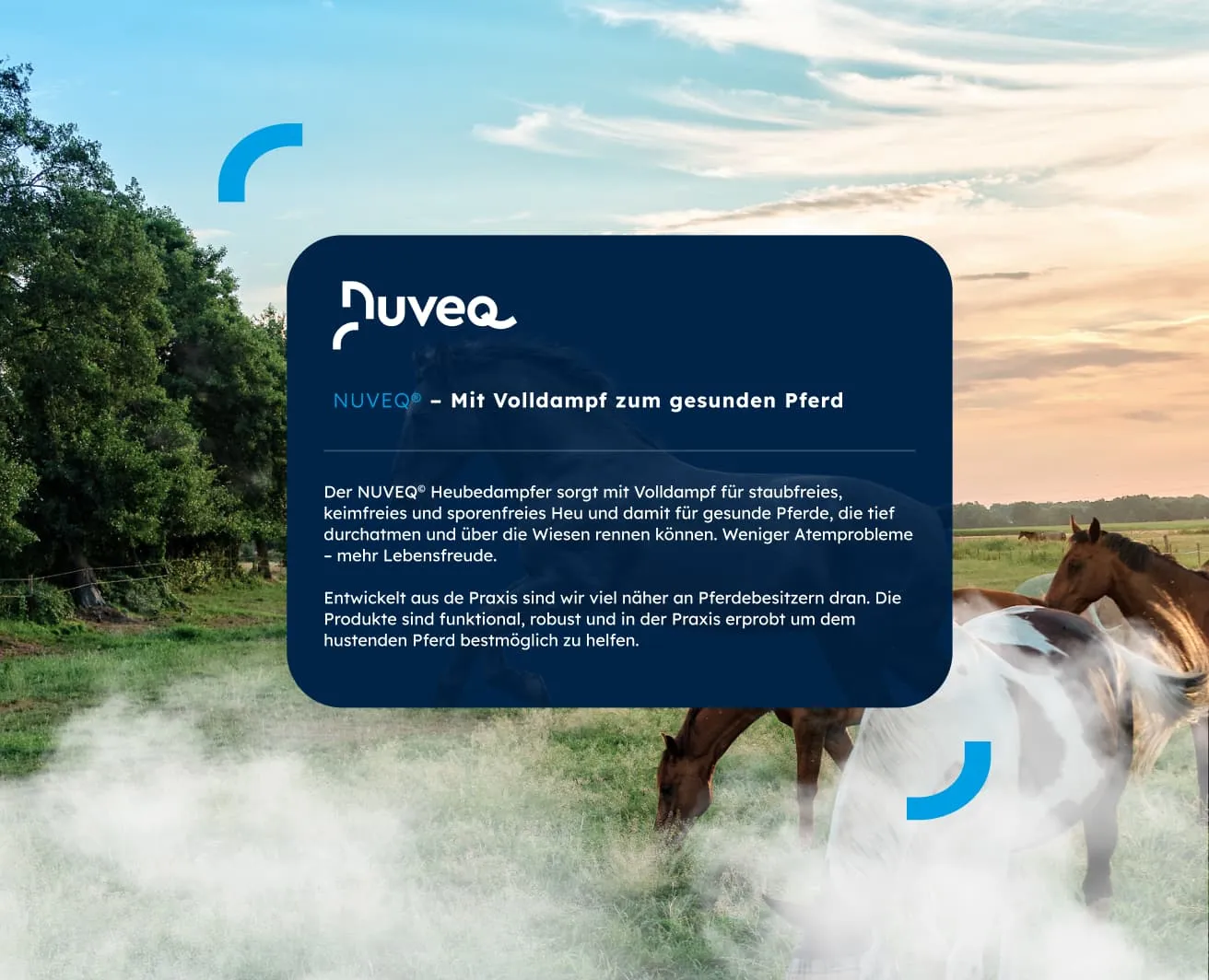
The steam generator model with its unique features was presented as a compact infographic. The clear, minimalist design makes the product instantly recognizable, understandable, and particularly appealing to users.
The steam generator model with its unique features was presented as a compact infographic. The clear, minimalist design makes the product instantly recognizable, understandable, and particularly appealing to users.
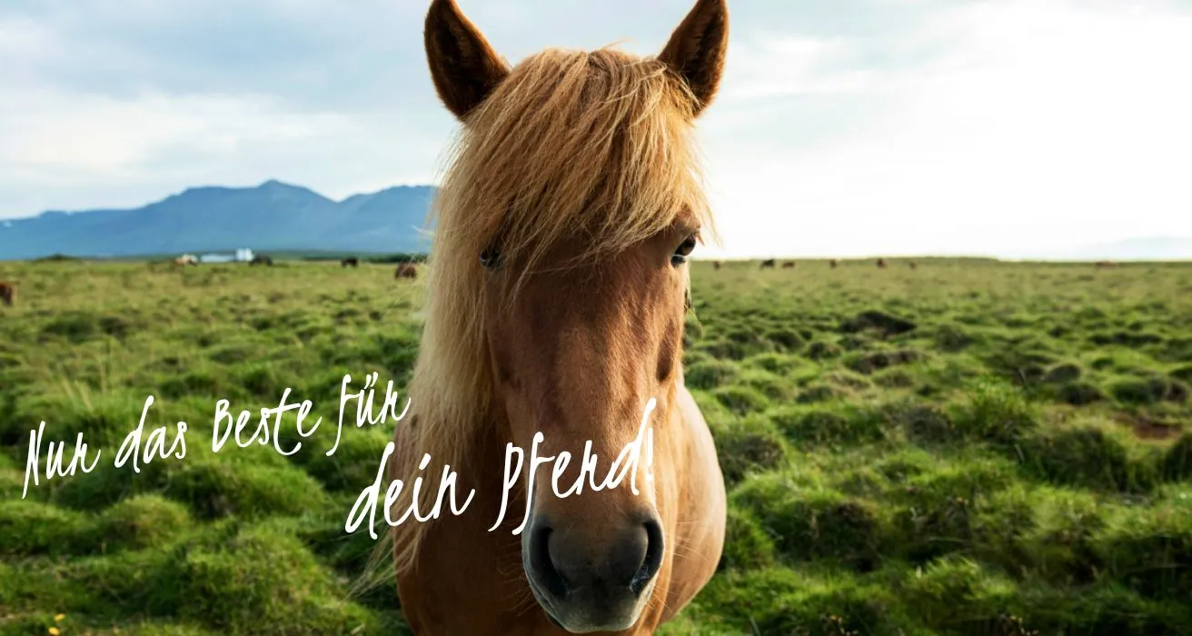
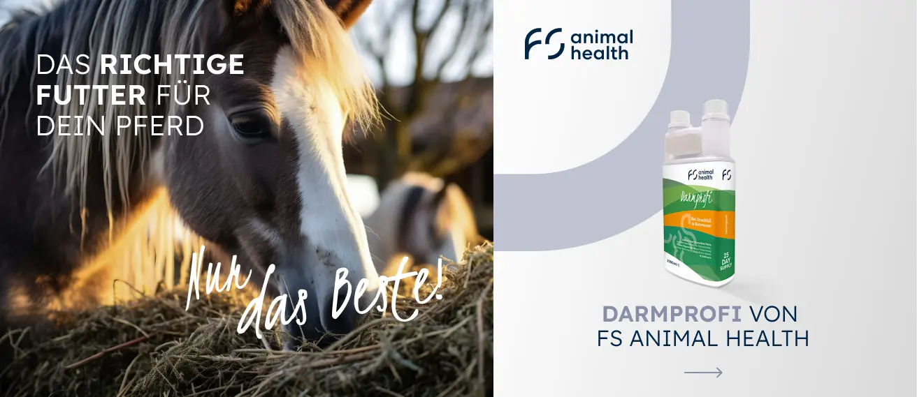
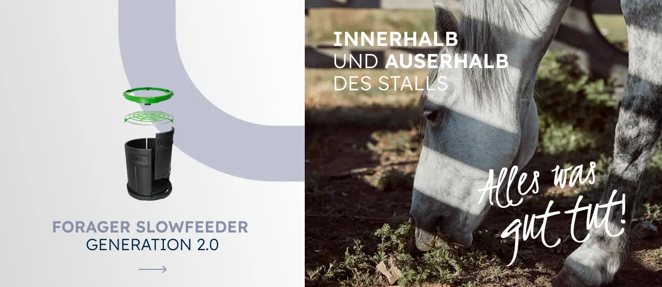
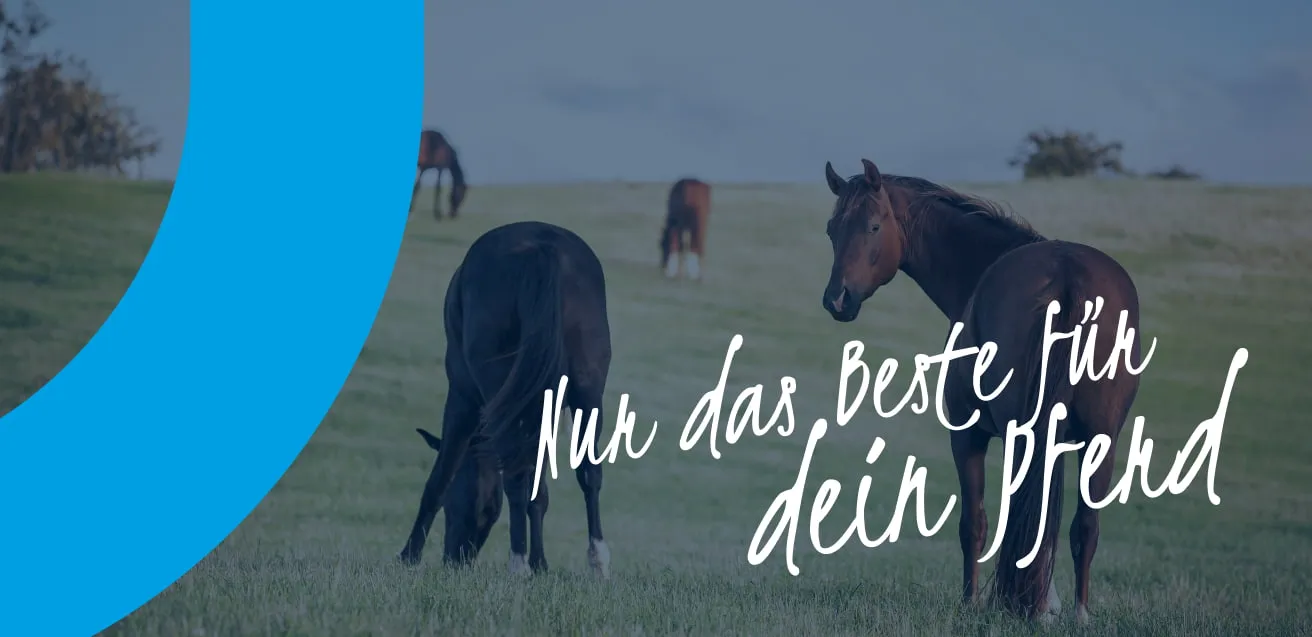
The landing page design picks up on the round shape of the logo and plays with it in different compositions. Fog effects add stylish accents and create a striking visual element. Naturalistic photos of horses in various everyday situations round off the design and convey authenticity and closeness to the target group.
Your partner for horse health
FS Animal Health is committed to helping horses live healthier, longer lives. The company works with various brands and offers a wide range of veterinary-supported products for care, therapy, and nutrition. Its mission to provide genuine care at the grassroots level is reflected in its diverse product range and close collaboration with riders, therapists, and veterinarians worldwide.
As part of the redesign, the products were visually standardized. Product cards were supplemented with 3D visualizations and consistently designed in line with the corporate design. The round shape of the logo runs through the entire layout and is used in various compositions. High-quality, naturalistic photos of horses in everyday situations ensure authenticity and harmonize perfectly with the balanced color scheme of the website. The typography is based on a striking, handwritten display font for slogans that attracts attention, combined with a functional sans serif font that serves an informational purpose—this combination appears organic and fits the thematic orientation of the site.
New landing pages were developed for several brands, with a focus on individual products that were highlighted. Clear typography, the three brand colors, and simple geometric shapes ensure clarity and user-friendliness. The design conveys an atmospheric, consistent appearance that strengthens the brand presence and underscores the trusting, personal cooperation with customers.
Share our work